| Welcome back to COVID in Minnesota TODAY, an email newsletter from MPR News about understanding the latest developments in Minnesota's COVID-19 outbreak. | | |
|
|
Last week I said I was becoming more wrong and less optimistic with every day that passed without the COVID-19 peak I predicted would happen on Aug. 18.
I am still becoming more wrong by the day. As for my optimism? It's still there — at least in the short term.
Maybe this makes me irrational, with the ongoing State Fair, a raging outbreak next door in South Dakota, and the imminent school year, all of which could very well combine with moderately high levels of COVID-19 circulation to send cases to new heights. That is definitely entirely possible. I would just caution against seeing this as inevitable.
I don't have any firm answers for you today, but will break down where things stand right now.
I'll also dive into a data point used by some vaccine critics, and explain where that number comes from and why it means something different than the people using it say they it does. |
| |
|
|
Three things to know
| - COVID-19 growth continues to slow, but it's unclear if they will peak soon or if public gatherings will spur significant new infections.
- A CDC database is being misused by vaccine skeptics to falsely claim hundreds of Minnesotans have died from COVID-19 vaccines.
- Similar criticisms leveled at death counts from the disease itself are off base, however.
|
| |
|
|
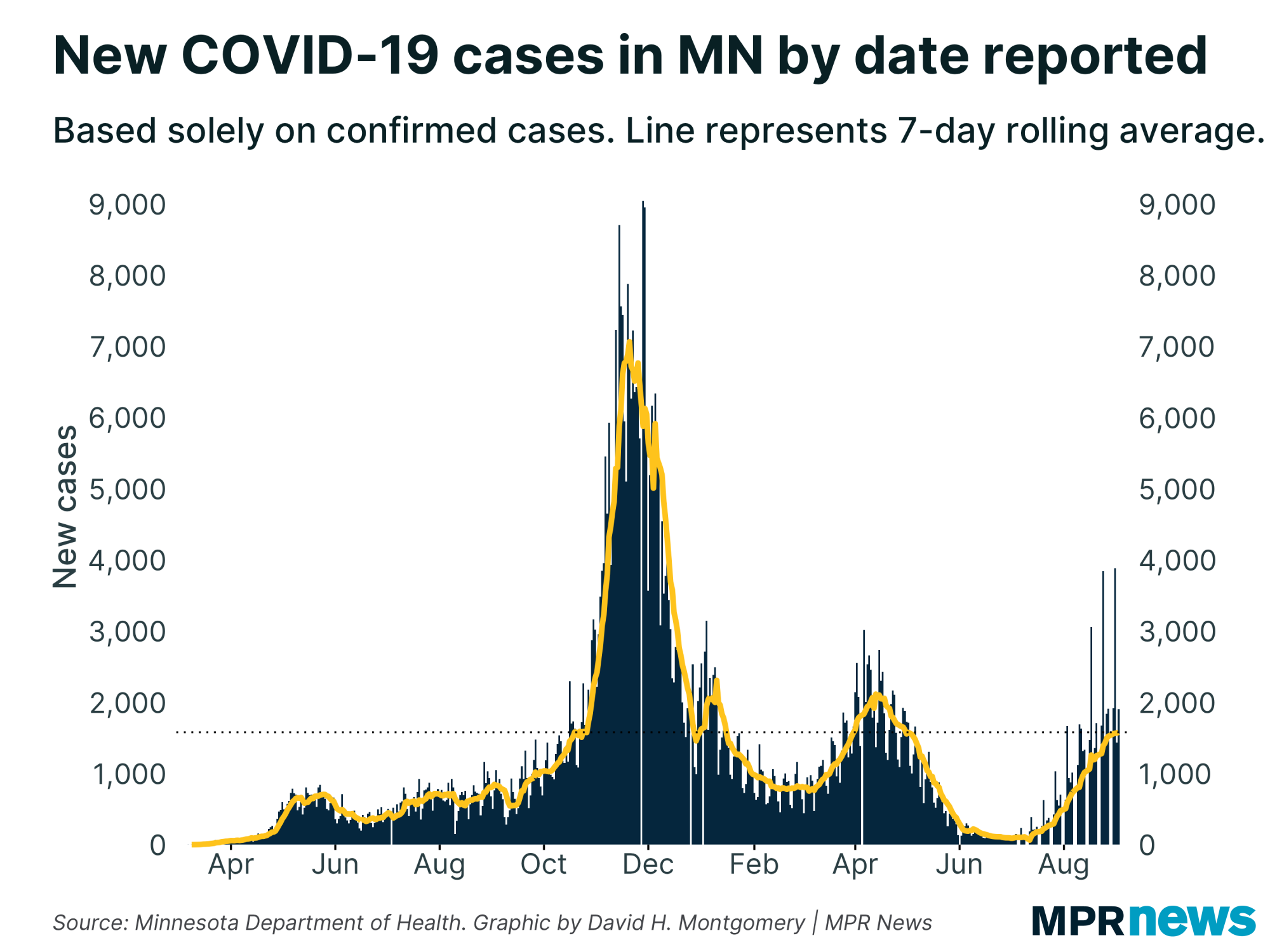
| If you look at the trendline of new cases in Minnesota, you can see something very interesting over the past week: a definite flattening out. | | |
|
|
You see that same thing with positivity rate, which controls for testing volume. After nine weeks of more-or-less steady increases, positivity rate is flattening out.
In fact, the most recent day's data even dropped a little bit, a sort of temptation to view this as the beginning of the long-awaited peak. It might in fact be that peak, but these stats jump around a bit, and if you cut off your data at the wrong point, it can look like things are about to either surge upward or plunge downward. So I advise caution — we won't know when the peak has occurred for sure until a few days (or more) after it, and that's fine. |
| |
|
|
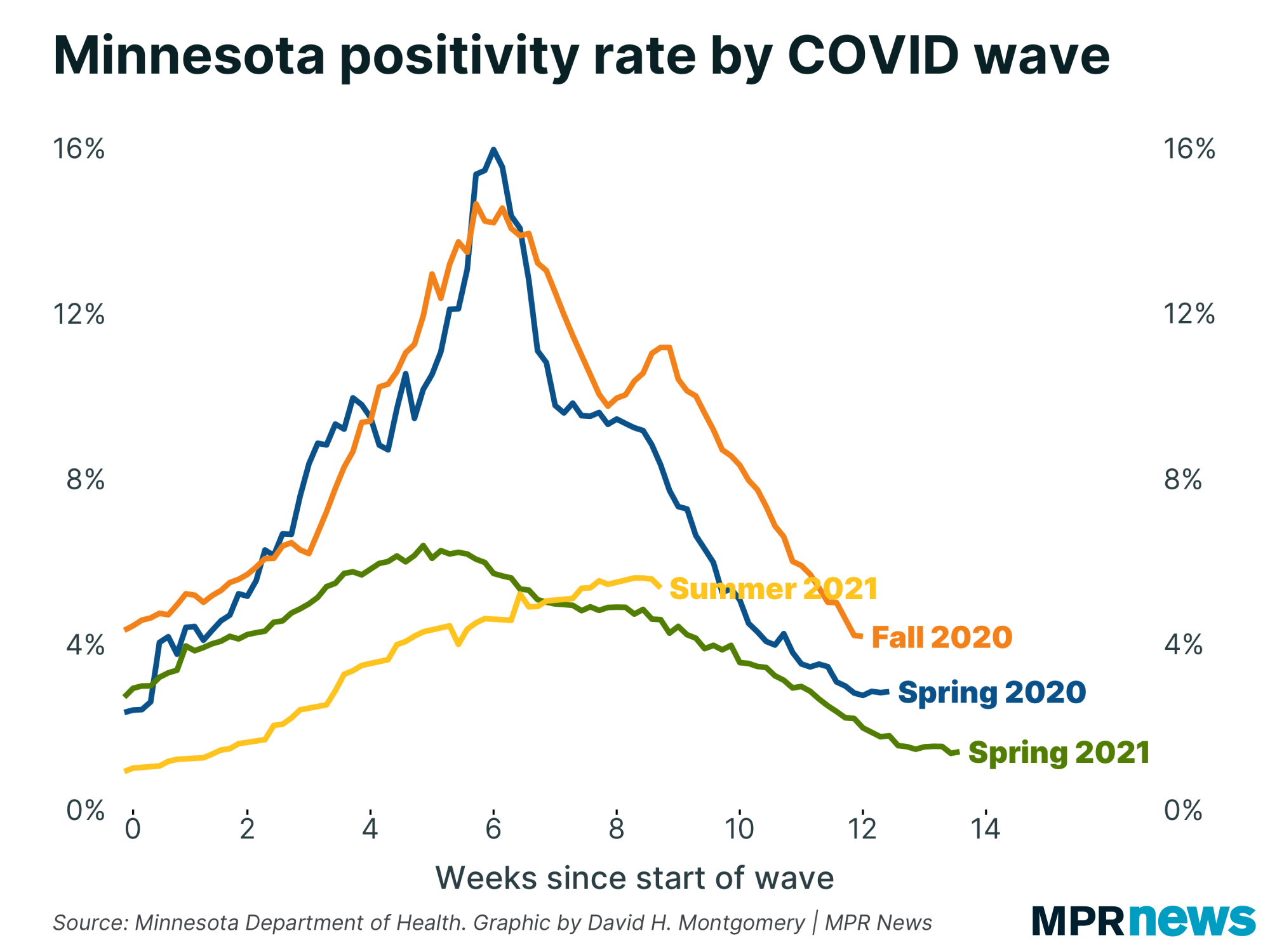
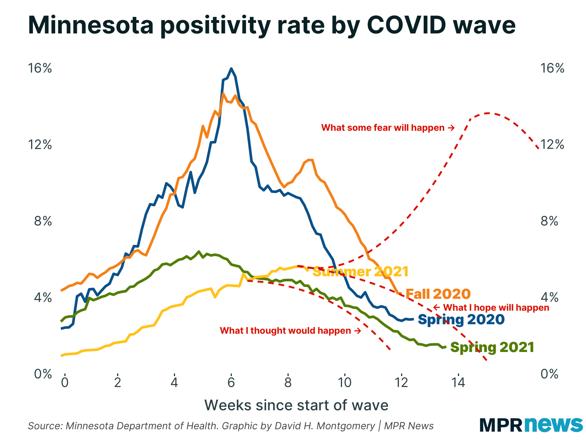
| I want to revisit this chart for a moment, with some crude annotations indicating three general trends: what I thought would happen, what I now hope will happen, and what some fear will happen. | | |
|
|
Don't take that chart too literally. I just found it helpful as a way to visualize my own thoughts on the range of possibilities ahead of us.
One helpful reminder from this: even if we peak tomorrow, it'll still likely take months of gradually declining caseloads before we get back down to the lows of June.
(In other words, November, the same month cases exploded last year. If you're a big believer in the seasonal theory of COVID-19 I expounded a few weeks ago, that's not a comforting thought. But our sample size is extremely low.)
Regardless: Growth rates of all three key "leading" metrics that I watch have all been trending in the right direction. Cases, positivity rate and new COVID-19 hospitalizations are all showing steadily slowing growth, and have been for weeks. This slowdown has sometimes been uneven, and there's no guarantee it will continue. But it is still happening, and if trends continue we'll see growth actually reverse soon. |
| |
|
|
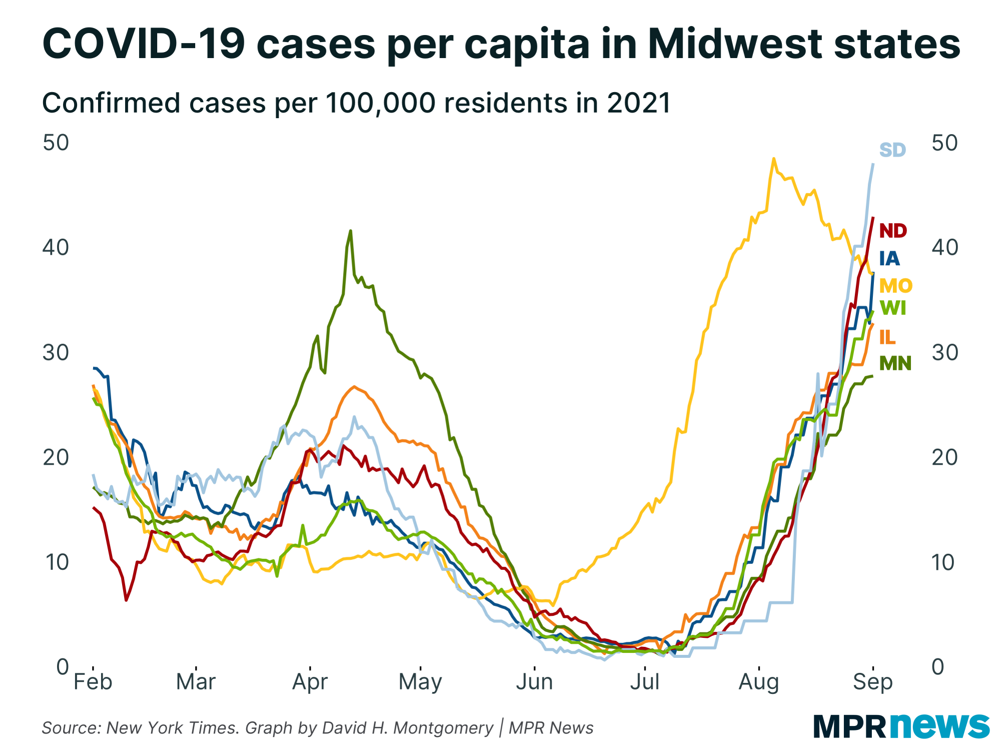
Here's the broader context in the region. Missouri, which had an early summer wave like many southern states, peaked a month ago and is gradually seeing cases decline. South Dakota, meanwhile, has seen its cases explode over the last month, to levels already matching Missouri's peak. North Dakota isn't far behind.
Meanwhile, Minnesota has the lowest per-capita case levels in the region. But one rule I've deeply internalized over the last year and a half: If it looks like one place is dodging a COVID-19 outbreak, wait a month or two before declaring victory. That doesn't mean that an outbreak in South Dakota guarantees continued case increases in Minnesota down the road — just that we shouldn't discount the possibility. |
| |
|
|
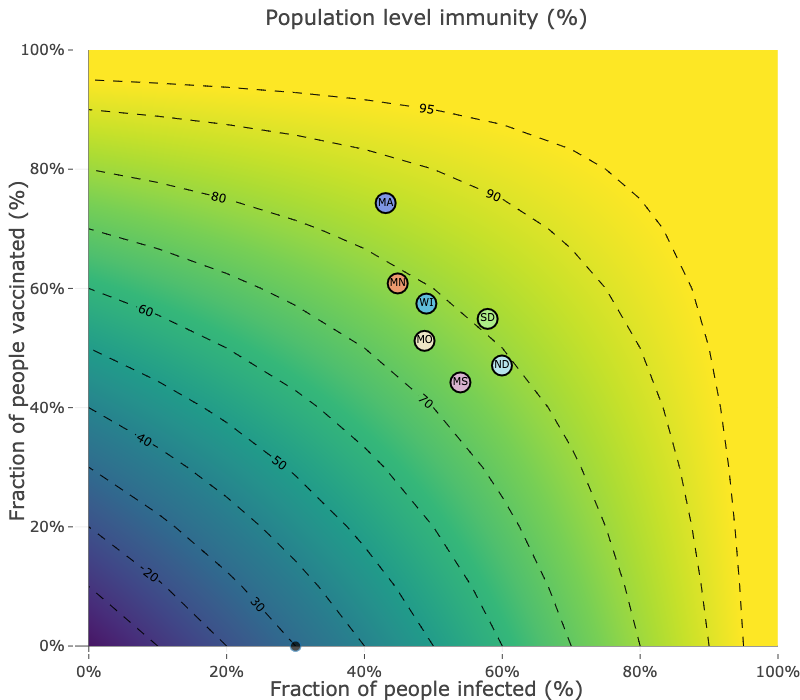
Let's zoom out even more and look at the truly big picture. Ultimately what matters is the share of a population who is susceptible to COVID-19. If that number gets small enough, the disease won't be able to reach epidemic proportions, because it doesn't have enough potential hosts. This is the famous "herd immunity" concept. Reaching this threshold doesn't mean the disease dies out — it can still have flare-ups in susceptible pockets of the population — but it tends not to become a populationwide menace like COVID was.
Experts used to estimate, or hope, that 70 to 80 percent of the population with immunity to COVID-19 would be enough to prevent outbreaks. But the recent surges in states like South Dakota suggest that with the hyper-contagious delta variant, that herd immunity number may be higher.
South Dakota isn't like southern states with really low vaccination rates. Around 55 percent of South Dakotans are vaccinated, 10 percentage points above Mississippi and about 5 points below Minnesota. Combine that with immunity from infection (and an estimate that actual infections are about four times higher than confirmed infections), and you can get a plausible figure that 80 percent of South Dakotans have some immunity to COVID-19, as this chart from Quan M Nguyen, Stephen J Beckett and Joshua S Weitz shows: |
| |
|
|
Obviously these are just estimates. It's entirely possible that our population-level immunity is somewhat lower than these estimates. But I think the general idea still holds: We thought we had enough people protected to prevent another COVID-19 wave, and we clearly didn't. That doesn't mean such a level doesn't exist, or that it's unreachable — being able to vaccinate a significant share of children under 12, which could happen later this fall, would be a big step. Employer vaccine mandates and, more dangerously, continued infections will also push that herd immunity levels higher.
(As we've seen, vaccination or prior infection isn't a guarantee against infection. Breakthrough cases do happen. But they're relatively rare.)
The pandemic won't last forever. But how long it will last remains deeply uncertain. |
| |
|
|
| Anatomy of a bad statistic |
In a speech last weekend at an anti-vaccine mandate rally at the Minnesota Capitol, state Sen. Jim Abeler said there have been "212 (deaths) in Minnesota from the vaccine."
That statistic is groundless. But it's not made up out of thin air, and it's not the first time similar stats have been used by vaccination critics.
Here's what's going on.
First of all, this isn't about "breakthrough" deaths, where people get a COVID-19 vaccine but then get sick and die anyway. We have stats on those, and the count as of Monday was 80.
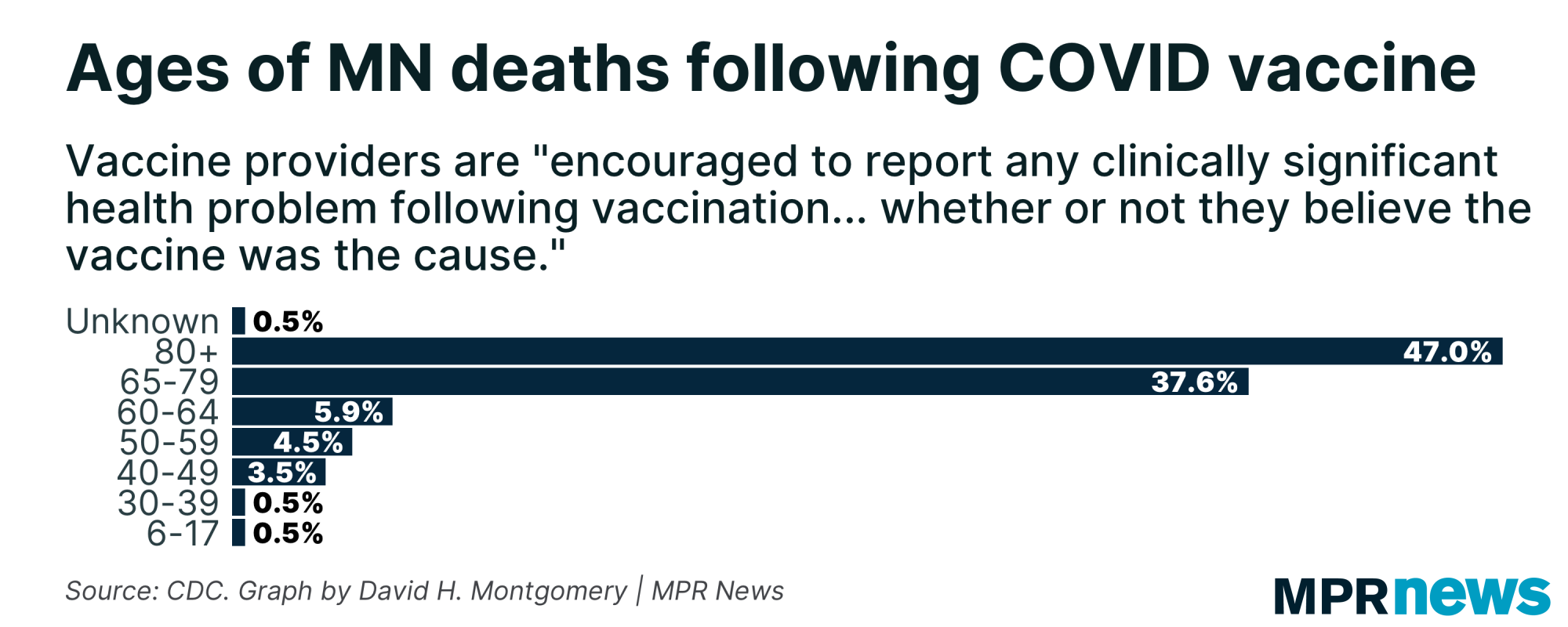
Rather, Abeler's figure derives from the Centers for Disease Control and Prevention's "VAERS" database, or Vaccine Adverse Event Reporting System. That's a database of "information on unverified reports of adverse events (illnesses, health problems and/or symptoms) following immunization with U.S.-licensed vaccines." The Minnesota Department of Health told MPR News reporter Tim Nelson that they provided this 212-death figure to Abeler.
Basically, the CDC has a database set up where they encourage people to report any health issues people have in the days and weeks after getting any vaccine. The idea is to gather all that data in one place so that if there is a vaccine that's causing medical issues — as occasionally happens — the CDC can identify it quickly and respond.
But the VAERS database itself is explicitly "unverified" information. Anyone can submit a report about a medical issue someone experienced after a vaccine, whether the vaccine actually caused it or not.
Looking in VAERS for Minnesota deaths experienced after the COVID-19 vaccine, I got a figure of 202 deaths. That's not exactly the 212 deaths Abeler cited, but it's close, and possibly the result of differences in search parameters.
The more important question: what are these 200-plus deaths that happened after COVID-19 vaccinations?
As it turns out, the database includes a "description" field that includes a narrative of the incident. But a significant share of these simply read some variant of, "Patient death within 60 days of receiving the COVID vaccine series," with no alleged causal connection at all to the vaccination. These are just people who died who happened to have received a COVID-19 vaccine in the past two months.
Among the deaths that have more detailed narratives, some seem clearly unrelated, like a senior over 80 years old who experienced "death due to age and dementia," but since they had been vaccinated in the past 60 days, they appeared in the database.
Others were people who died of COVID-19, either in a breakthrough case, or before their antibodies fully developed post-vaccination. One example: "COVID symptoms started within 8-9 days of vaccination. No fever, general not feeling, chills. Turned into very difficult breathing, low oxygen levels and pneumonia."
There are entries that involve someone taking a sharp turn for the worse after being vaccinated, like this one: "Approximately 3 hours after vaccine administration, patient experienced the following: Nausea, Vomiting, Abdominal pain, and the following day: Bloody Bowel Movements."
But none of this analysis is causal. They're deaths that happened to occur within 60 days of vaccination. Most of the deaths were seniors, and nearly half of them were over 80 — age demographics with fairly high mortality rates even without vaccines or COVID-19. |
| |
|
|
Additionally, as I noted before, these unverified reports can be submitted by just about anyone, without any verification. Some are written in highly technical medical language. Others are much more casual, like one that said, "My mom died Saturday morning — within the 24-hour period of her vaccine."
As a final note, even if it were true that 212 people had died from COVID-19 vaccines in Minnesota — which, again, there is zero evidence for — that would be a mortality rate of 0.0068 percent of the 3.1 million fully vaccinated Minnesotans. In contrast, there have been 7,839 deaths out of 653,288 confirmed COVID-19 cases in Minnesota, a mortality rate of 1.2 percent. That's more than 150 times higher.
With all this under consideration, using the raw count of VAERS entries as proof of anything is just bad use of data.
Even Abeler acknowledged this, tweeting that "VAERS is imperfect but records enough valid adverse cases to warrant deeper looks by MDH & CDC" — a much softer argument than his initial statement that there have been "212 (deaths) in Minnesota from the vaccine," though he continues to be skeptical about the vaccines.
Is it possible that there were Minnesotans who have died specifically as a result of getting vaccinated against COVID-19? Sure. Adverse effects do sometimes happen after vaccines, including due to allergies.
But the VAERS entries don't prove or even reliably suggest that a single Minnesotan has been killed by a COVID-19 vaccine — and certainly not that more than 200 have.
Form whatever opinions you want. Just don't use bad data to justify them. |
| |
|
|
| But isn't this what people said about COVID deaths? |
One response some people had to this argument was to analogize to reported deaths from COVID-19. The argument there, especially from skeptics of lockdowns and thus of the scary statistics sometimes used to justify them, was that the statistics of COVID-19 deaths were inflated and just reflected people who died "with COVID" rather than necessarily people who died "from COVID."
This argument is largely incorrect. If you get hit by a truck, you're not counted as a COVID-19 death, even if you had a confirmed case of COVID at the time. (That's not to say there was never any case of something like this happening — death certificates are filled out in a decentralized way by doctors and local coroners, and there's lots of opportunity for slip-ups to happen. Just that it was never anything common or systematic.)
But determining cause of death is fundamentally a judgment call, especially for a disease like COVID-19 that often kills in conjunction with other conditions. Would a sick person have lived if they hadn't added COVID to their other ailments, or would they have died anyway? Sometimes there's no clear right answer.
So this is going to be a little fuzzy at the margins. But the broad picture isn't fuzzy at all. In fact, the mortality rate is by far the clearest thing about the entire pandemic.
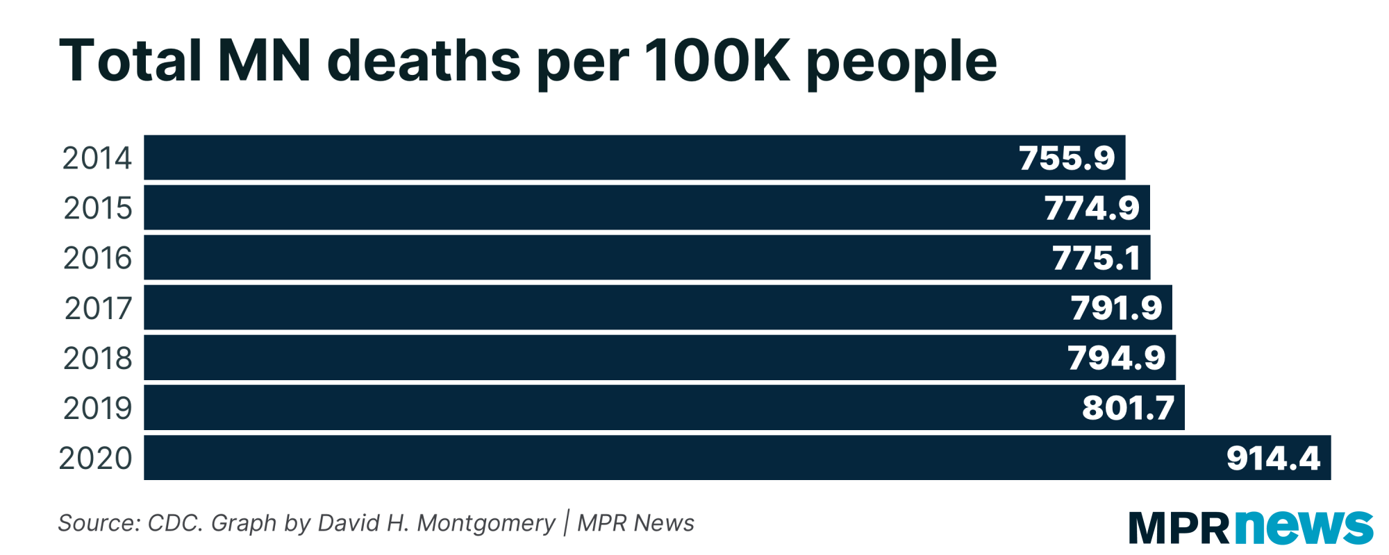
Even if you think that case counts are massively inflated, that masks are useless and lockdowns worse, that the government is manipulating the COVID death counts to scare people — there's no way around it, significantly more people have died over the past year-plus than is normal. |
| |
|
|
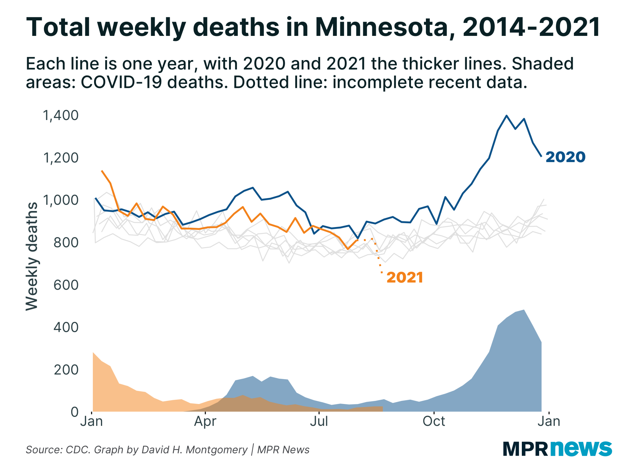
| And if you plot out those death rates over time, the spikes in total, total death counts happen to match up extremely closely with reported COVID-19 waves. | | |
|
|
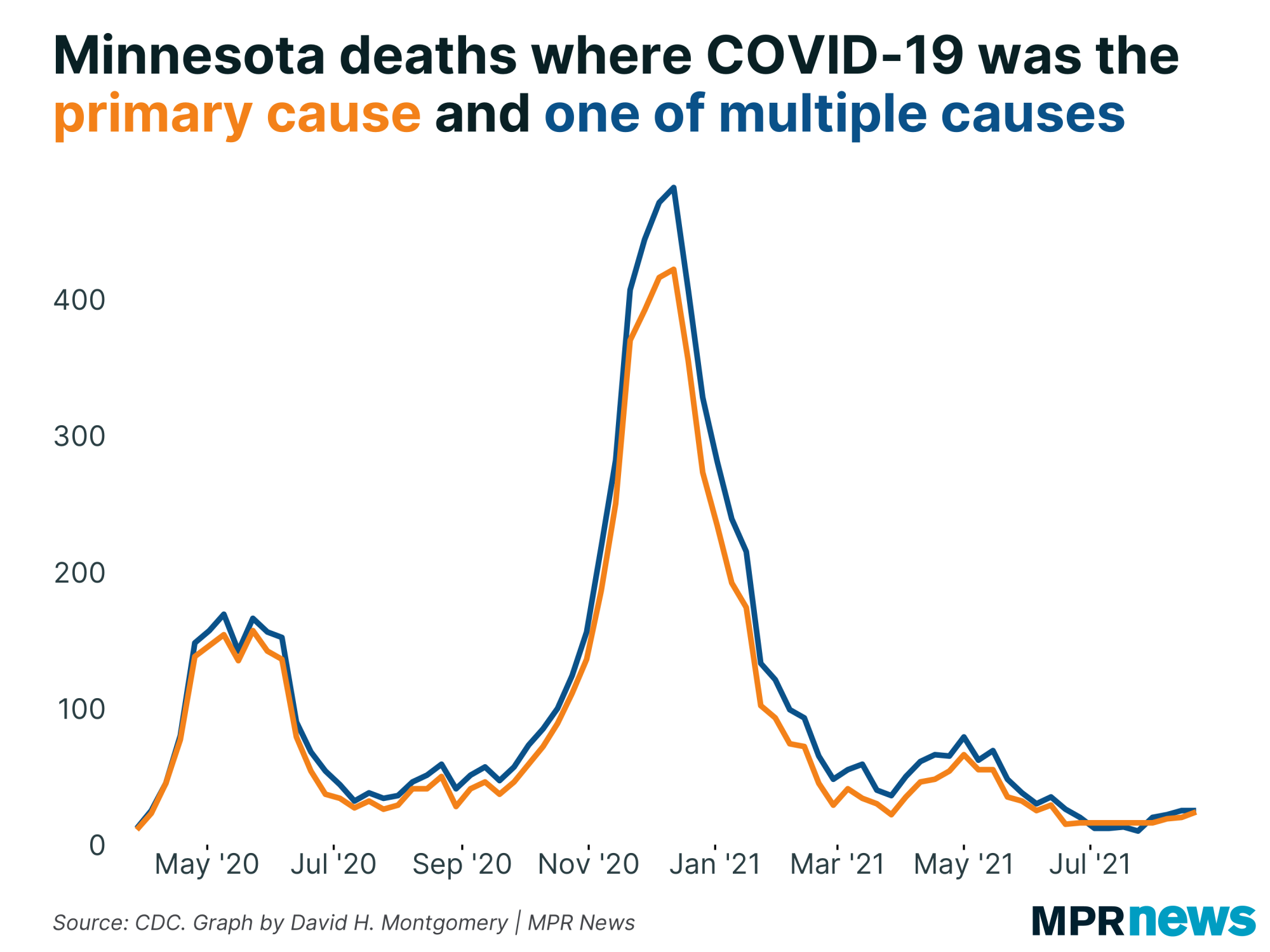
Minnesota makes its bulk death certificate data available for purchase for a relatively low fee — $20 for a year's worth of data — and MPR has purchased weekly updates for most of the pandemic. I've looked at this data, which distinguishes between primary causes of death and additional factors, and in the COVID-19 deaths, COVID-19 is usually a major factor.
The CDC's death data presents two different statistics for COVID-19 — deaths where COVID-19 was the "underlying," or primary cause of death, and deaths where it was one of multiple significant factors. There are, unsurprisingly, more deaths in the latter category. But the two lines have very similar trajectories, and a majority of the deaths reported here have COVID-19 identified as the simple underlying cause. |
| |
|
|
Below, I'll explore a few more stats about Minnesota's COVID-19 outbreak. If you want to learn more, I also recommend these other articles:
| | |
|
|
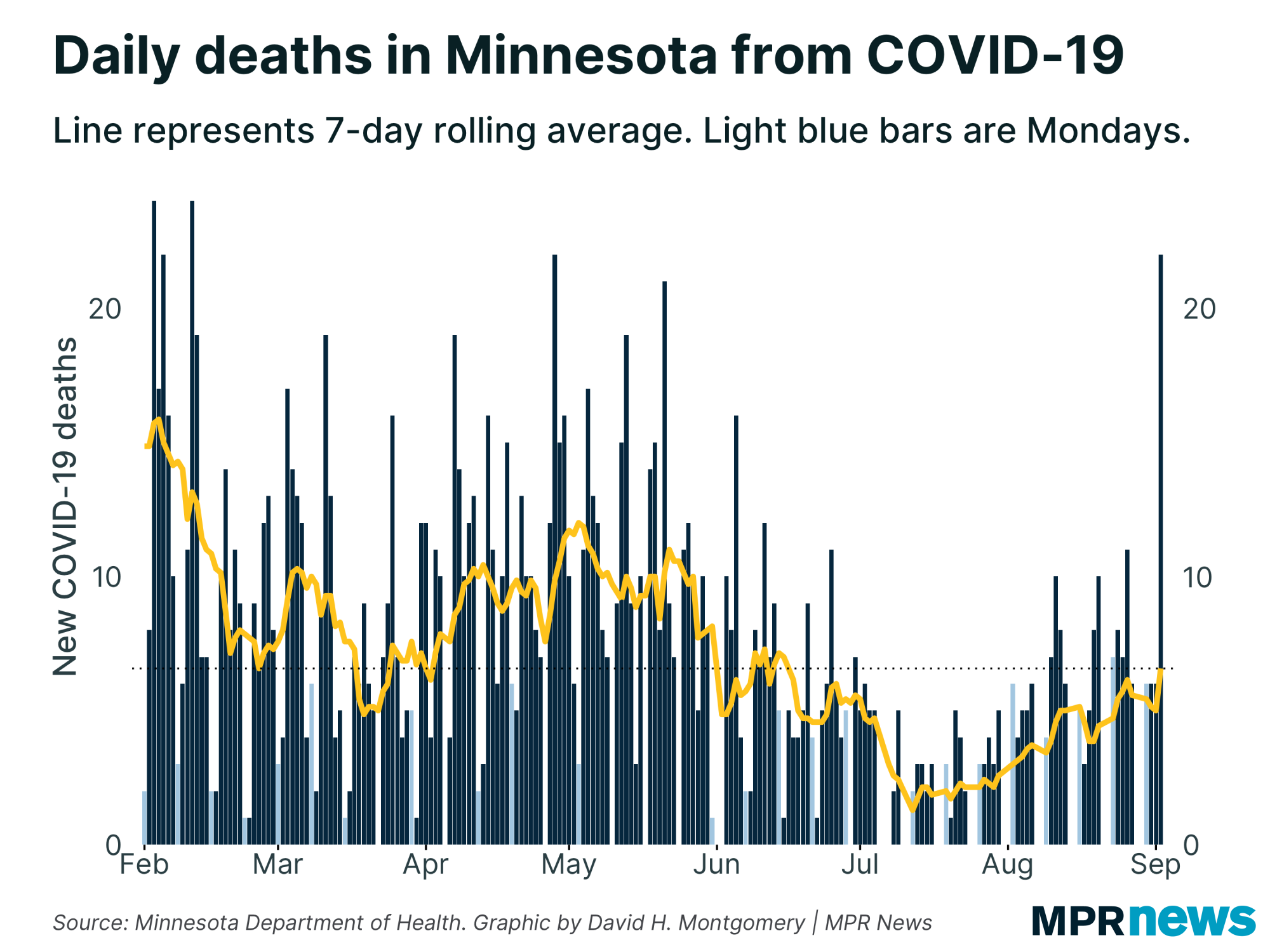
| Deaths take a one-day spike | COVID-19 death rates are the laggiest of lagging indicators, and they don't tell us much about how an outbreak is going right now. Rather, they tell us how the outbreak was going three or four or more weeks ago.
So I wouldn't recommend panicking over Thursday's report, which included 22 newly reported deaths — the most in one day since May. This wasn't a weird data backlog issue, either; most of these deaths were from the past week or so. |
| |
|
|
You might note, if you count out from the light blue Monday bars, that the last few Thursdays have tended to see the highest death counts of the week. Not usually as high as this, usually, but the rolling average only ticked up a little bit today.
I'll keep watching to see if this apparent freak occurrence turns into a longer-term trend, but so far between the lag and the abnormality, you shouldn't yet treat this as a bad sign. |
| |
|
|
A weird divergence between antigen and PCR tests
|
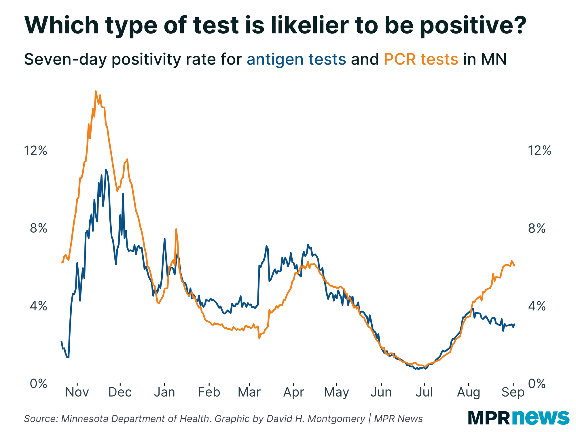
There are two types of COVID-19 tests available; PCR tests, generally seen as the gold standard, with minimal false positives and the ability to detect COVID-19 infections even before symptoms emerge, and antigen tests, which are less sensitive and less specific, but cheaper and much faster.
For most of the past year, the positivity rates of these two kinds of tests have move largely in sync with one another. There were periods where PCR tests had higher positivity rates (like during the Fall 2020 wave), and periods where antigen tests did (like during the lull this past winter), but these were differences of degree. When one went up, so did the other one.
But something changed a month ago. Since the start of August, the positivity rate for PCR tests has continued to rise, up to about 6 percent. Meanwhile antigen tests have seen their positivity rate decline, down below 4 percent. |
| |
|
|
There are lots of plausible explanations for this divergence. Maybe testing mandates are flooding the zone with lots of healthy people taking required cheap antigen tests. Maybe the details of this latest outbreak, with many fewer serious cases, are easier to detect with the higher-quality PCR tests.
But what the actual correct answer is, I have no idea. I find it fascinating, though, so I'm sharing it with you fine nerds. |
| |
|
|
What's happening next?
|
Next week is a critical time! If current trends continue, it's when Minnesota could see cases and positivity rate start to decline. But it's also when we would expect to start to see any possible case bump from the State Fair (if one occurs). Any major case bump from school reopenings after Labor Day would take at least another week to show up.
Thanks for subscribing to this newsletter and for all of you who've sent me your feedback. As always, if you like this newsletter, please share it and the sign-up link with others who you think might enjoy it.
— David |
| |
|
|
Preference Center ❘ Unsubscribe You received this email because you subscribed or it was sent to you by a friend. This email was sent by: %%Member_Busname%%
%%Member_Addr%% %%Member_City%%, %%Member_State%%, %%Member_PostalCode%%
  |
|
|
| | |