| Welcome back to COVID in Minnesota TODAY, an email newsletter from MPR News about understanding the latest developments in Minnesota's COVID-19 outbreak. | | |
|
|
Yesterday was Aug. 18, the day that last time I predicted Minnesota's COVID-19 wave would peak. I also promised that I'd update you on how that prediction turned out.
The bad news is that Minnesota has not, in fact, peaked.
The good news is that it looks like we're still on track to peak, and that it'll probably happen soon.
This is a jam-packed newsletter! I'll explore what the data says about when we'll peak below, along with what will happen next. I've also got fascinating data about breakthrough cases and the racial divide in Minnesota's vaccination rates. Buckle up! |
| |
|
|
Three things to know
| - Minnesota is on track to see its fourth COVID-19 wave peak in the next week, but what will happen next month remains uncertain
- Breakthrough cases among the vaccinated are rising, though not disproportionately so
- The Twin Cities metro is showing a huge racial gap in COVID-19 vaccination
|
| |
|
|
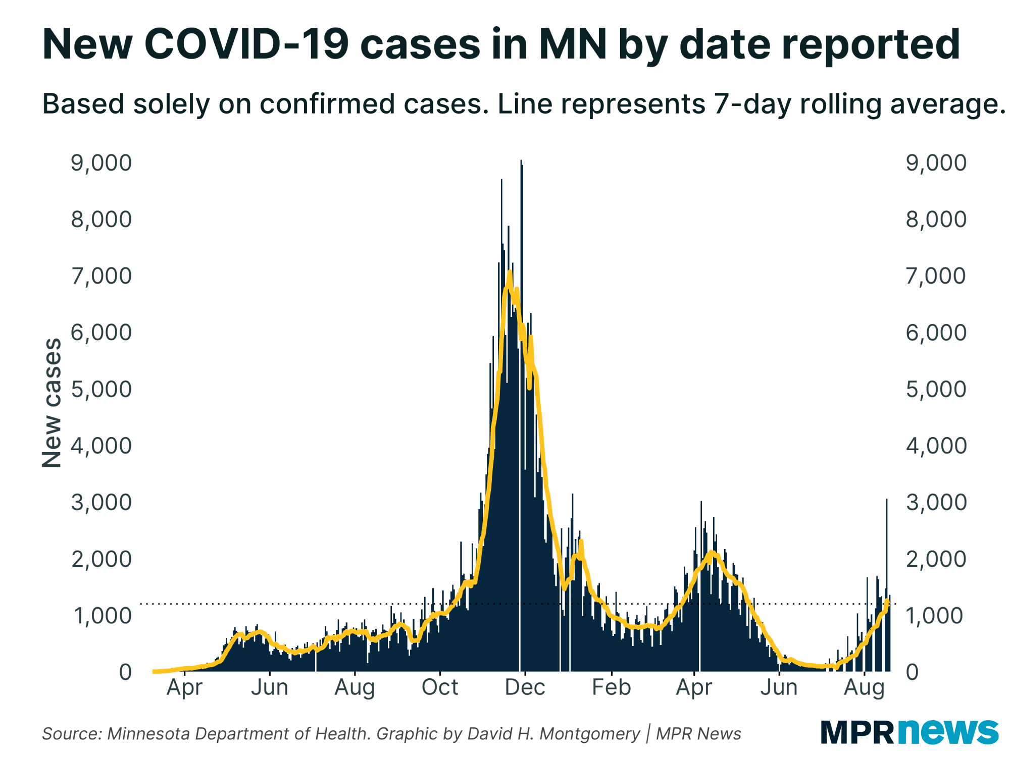
Here's the general trend right now. Minnesota is averaging around 1,200 cases per day. That's up from about 900 cases per day a week ago.
But don't be confused, as some people have been, by how I can say a peak is near when Minnesota is still seeing cases rise to levels we haven't seen in months. This is exactly what we should expect — a peak is when cases stop rising, so until the peak arrives, we should expect cases to keep rising to new highs! |
| |
|
|
Also, don't be confused by individual daily spikes, like we saw in Tuesday's report with more than 3,000 newly confirmed cases. Over the past year and a half we've had plenty of weird outlier days. Often, as with this week, we see the data immediately snap back into trend, suggesting that a data anomaly just pushed a bunch of cases forward or back a day.
Focus instead on the yellow line, plotting the seven-day rolling average. This smooths out any outliers and adjusts for day-of-the-week effects (such as how in Minnesota, we no longer get any data on weekends and instead get three days of data at once on Tuesdays).
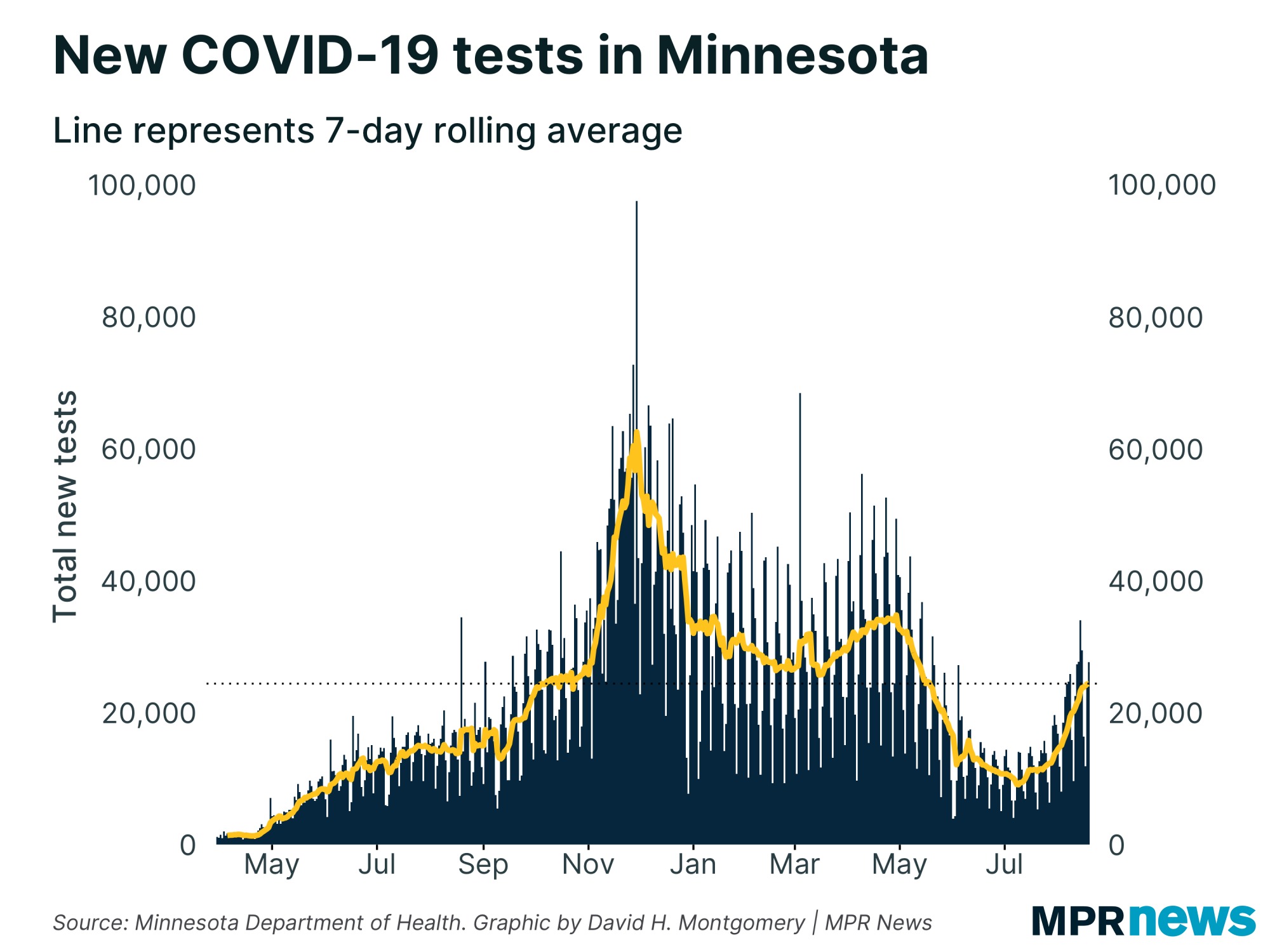
You also probably shouldn't focus too much on raw case counts (though sometimes they're the best data available). Since not everyone who's sick gets tested, case counts tend to rise when testing goes up — as it has, from less than 9,000 per day back in early July up to 24,000 per day now. |
| |
|
|
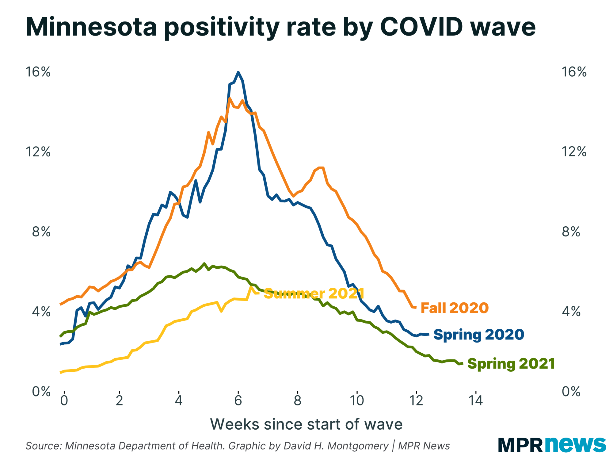
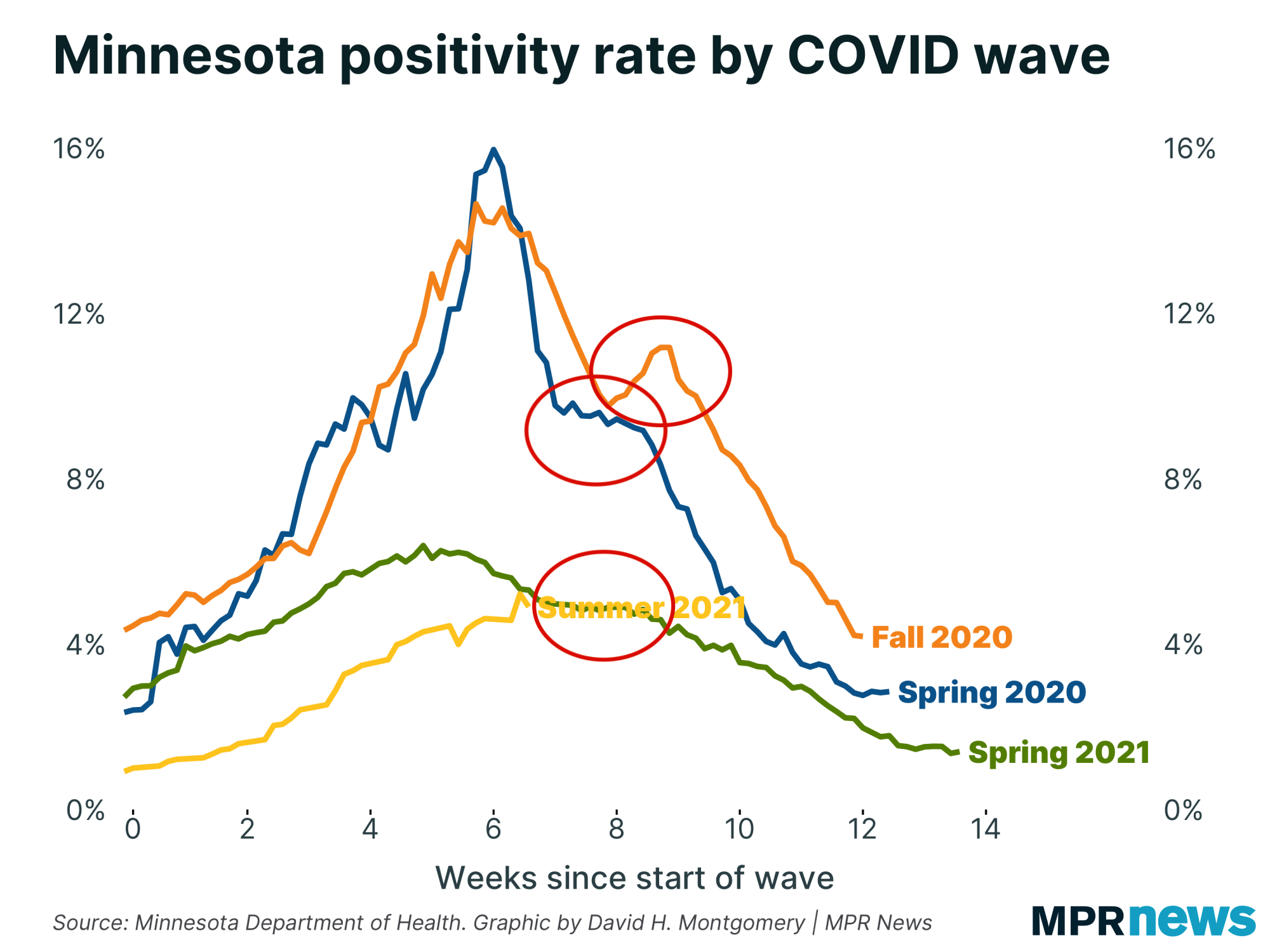
| Instead, as I've said many times, a better metric for tracking the spread of COVID-19 is positivity rate, which controls for testing volume. Here's how Minnesota's positivity rate has been changing, compared with past COVID-19 waves. | | |
|
|
The line tracking the current outbreak, in yellow, has bounced around a bit in recent weeks, so the trends can be hard to track. In general, though, there's been a leveling off — though more slowly than the Spring 2021 wave leveled.
You can see that leveling more clearly if you look at the rate of change in the positivity rate, as I showed last time. Minnesota's current positivity rate of around 4.9 percent is about 20 percent higher than the 4.0 percent we saw two weeks ago. But that 4 percent was double the 2 percent we saw two weeks before that. That's what I mean when I say the rate is slowing down and approaching a peak. Eventually we'll get to a point where our positivity rate is below what we saw two weeks ago. |
| |
|
|
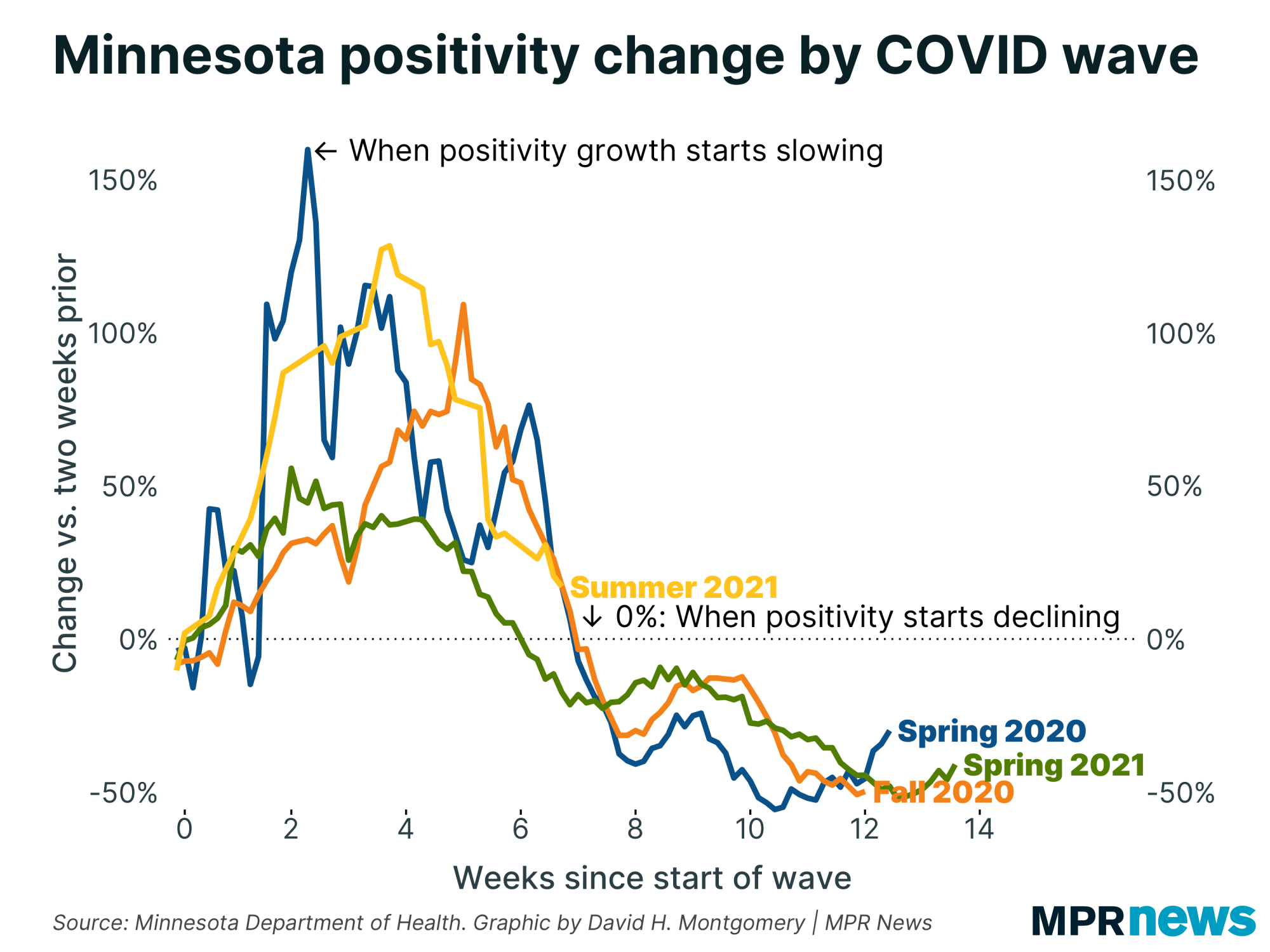
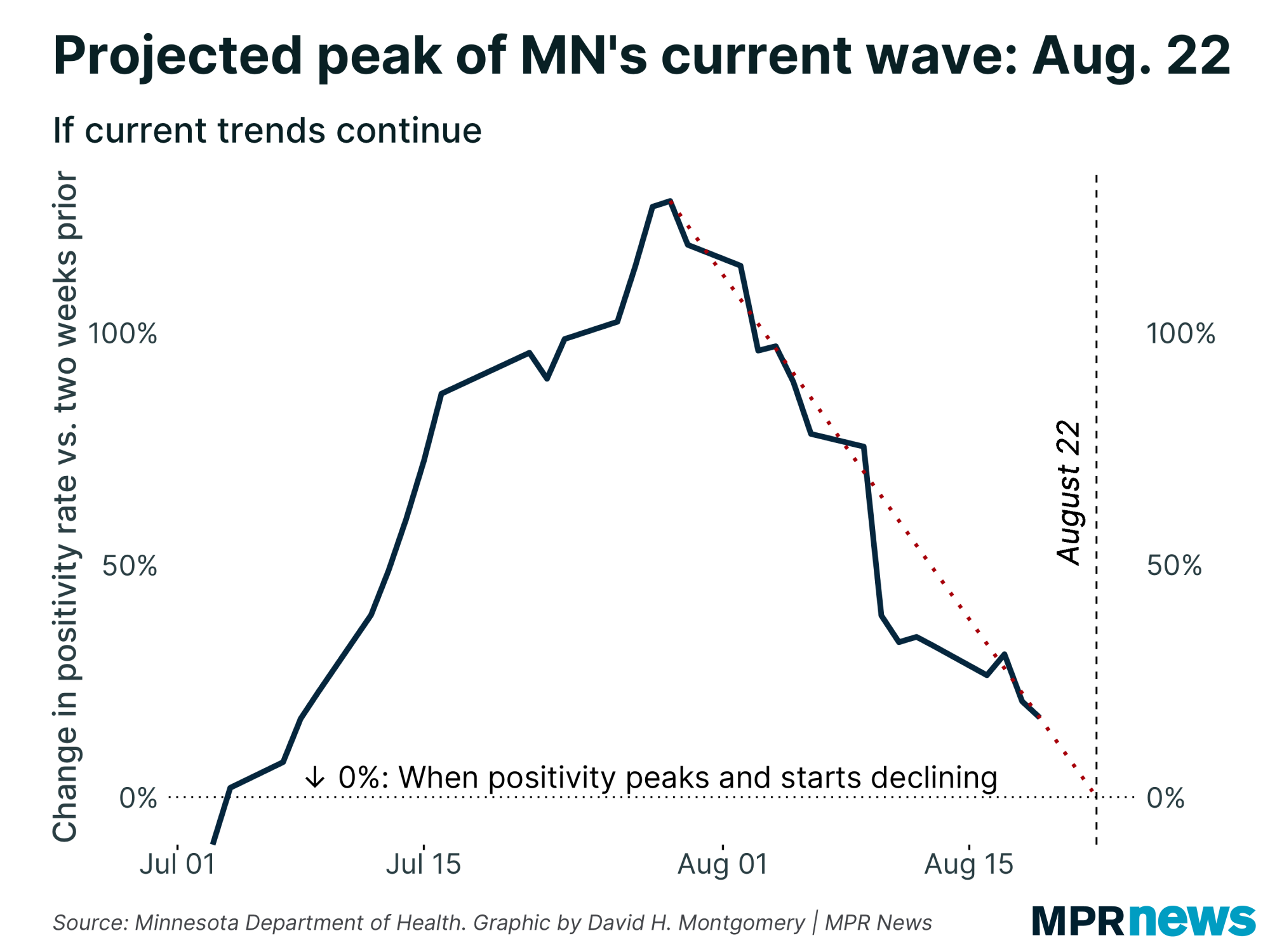
| We can focus in on the current wave to see things more clearly. The line has bounced around a bit, sometimes falling rapidly (that is, slowing growth), sometimes falling slowly or even bouncing upward briefly (accelerating growth). But the overall trend has been toward slowing growth. | |
|
|
|
As you can see, if you extend the pace out linearly from when positivity rate stopped accelerating in late July, we're forecast to peak around Sunday, Aug. 22.
But this is more art than science. This rate has jumped around a bit. It wouldn't be shocking now to see another big drop bring that peak sooner, or to see the slower pace of the past few days continue, stretching this out into next week.
It's also entirely possible that having crept right up to the edge of a peak, our wave ends up shifting back into growth.
I want to explore three different theories for what the future holds for Minnesota and COVID-19, what I dub the pessimistic theory, the seasonal theory, and the optimistic theory.
The pessimistic theory
Here are the elements of the theory underlying this pessimistic argument:
- The extra contagiousness of the delta variant means this wave will act differently than before
- Prior waves were at least somewhat constrained by measures like mask mandates; with those no longer in place the virus will spread faster
- Upcoming big social gatherings like the State Fair, Labor Day, and the start of school will provide an accelerant for infections, especially due to #2
- While places like Minnesota have had fairly mild waves so far, we're not that different from places that have had explosive delta waves, and can expect to follow in their footsteps
None of these arguments are absurd, and the case has a certain logic.
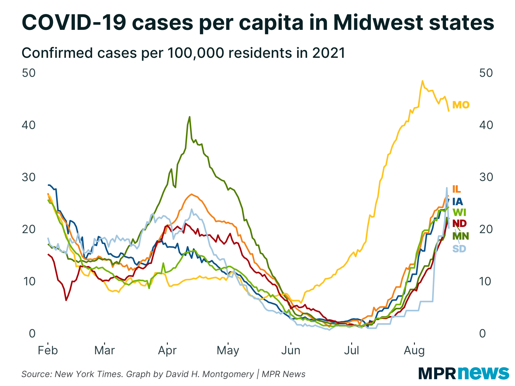
Here's one chart to bolster this pessimistic case: the per-capita case rates in a range of Midwestern states, including delta-ravaged Missouri. | | |
|
|
There are two striking things here that a pessimist might find persuasive.
The first is that light blue line, representing cases per capita in South Dakota, which has shot up dramatically in recent days (though it did tick back down sharply again today, suggesting that at least some of the volatility might be data-related). It's possible this is connected to the recent Sturgis Motorcycle Rally there, and it's possible that these cases are going to move east into Minnesota over the coming weeks.
The other is Missouri, which began its current wave a month earlier than the other states here, saw cases rise to much greater heights, and last for longer than the more common six or seven weeks.
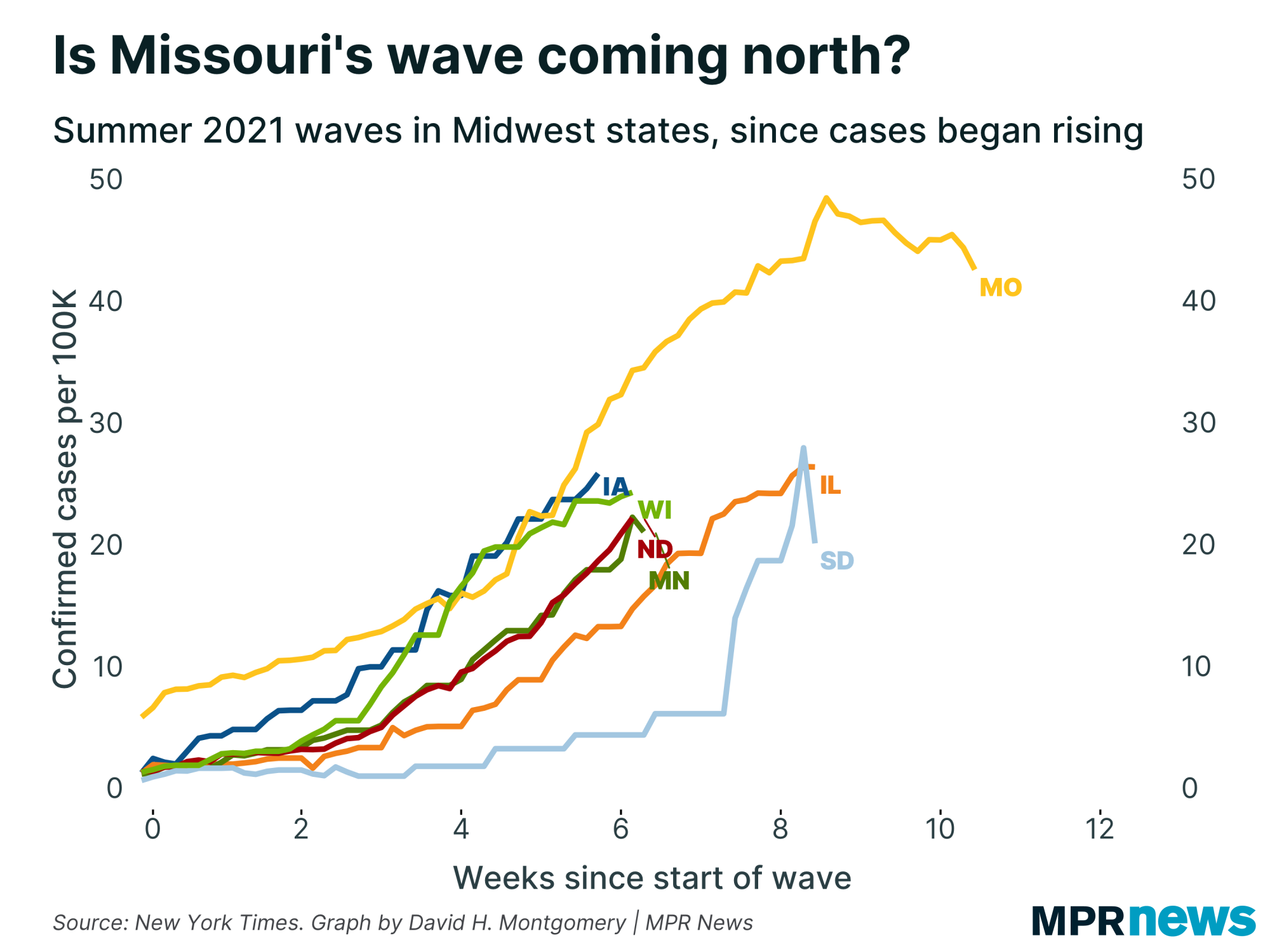
Here's that same graph, but with all the states crudely aligned from the day when cases first began rising this summer. |
| |
|
|
If Missouri's past is Minnesota's future, then far from being on the verge of peaking, we're in line for four more weeks of rising cases before finally peaking. (That's something similar to what the Mayo Clinic's model predicts.)
The seasonal theory
One theory is that cases in Minnesota are going to keep on rising for weeks to come, fueled by all the things I discussed above. But another theory is that we'll peak imminently, as I've predicted — but then will start a Fall 2021 wave a month or two later.
Here's the arguments behind that theory:
- The data says Minnesota's case growth is slowing and there's no good reason to believe it's wrong
- COVID-19 is at least to some degree seasonal, with warm-weather areas likely to have waves in the summer when everyone goes inside for air conditioning, easing transmission of the virus; cold-weather areas, in contrast, are likely to get their worst outbreaks in cooler months
- Therefore, while Minnesota may skate by with a relatively mild summer wave, it'll get smacked later this fall like southern states are now
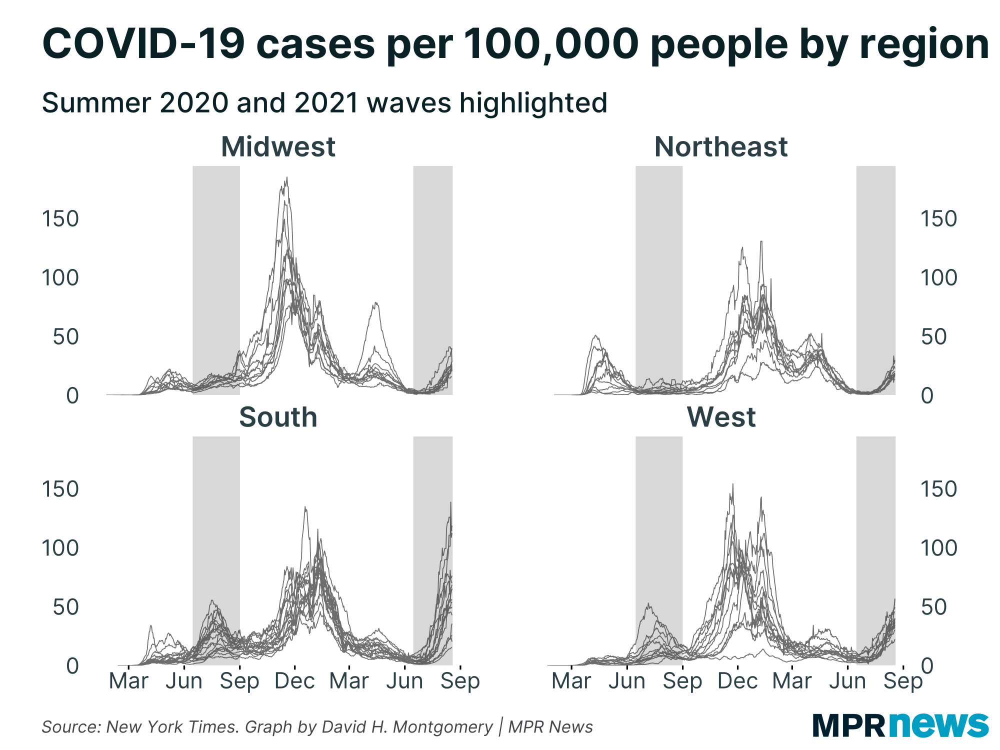
While what I termed the pessimistic argument builds on what happens in the very recent future, this seasonal argument builds on observations over the past two years, like how the South has largely not been hit by spring waves in 2020 or 2021, but has been hit by summer waves, while northern areas have tended to have milder summer infections but worse spring and fall waves. | | |
|
|
If this is true, an imminent peak is only temporary good news — a fifth wave awaits us.
There is, I should note, a second set of arguments that gets you to a fall wave without going hard on the seasonality factor. That's to take the pessimistic arguments above about how the start of school, State Fair, and other issues will spread the disease, but assume it will take time for this to take full effect. Instead of a continuing spike now, the argument goes, we may peak, but the wave will get a second wind by late September.
Minnesota's data actually shows signs of "second winds" with past waves, too, though they've always been fairly brief and mild. Look below at this chart from above, but with the period a couple of weeks after the peaks highlighted. All three waves had a period where cases either stopped falling, or actually started rising again, before reverting to improvement — a sort of "aftershock." So it wouldn't be a surprise or cause for panic if we see a brief uptick in cases in early September — but also this limited sample doesn't prove that any September uptick we get will be as mild as the last three aftershocks were. |
| |
|
|
The optimistic theoryThe third case to consider is the optimistic argument:
- An increasingly dominant share of Minnesotans already have resistance to COVID-19, from vaccination or prior infection, thus increasingly limiting the virus's ability to spread freely
- So while COVID may not go away entirely any time soon, any flare-ups will be relatively moderate
- The people who do catch COVID will be unlikely to die or suffer serious health risks, since most of the older or at-risk people are already immunized
The driving idea behind this one: even with more dangerous variants out there, Minnesota's summer wave was milder than our spring wave, which was (much) milder than our fall wave. If this is just due to rising population immunity, we should expect this trend of diminishing waves to continue. Of course, the experience of southern states this summer shows the ways this argument could be wrong, too — while most of them are less vaccinated than Minnesota, they all still have far more population immunity now than they had last fall or this spring, and still got walloped.
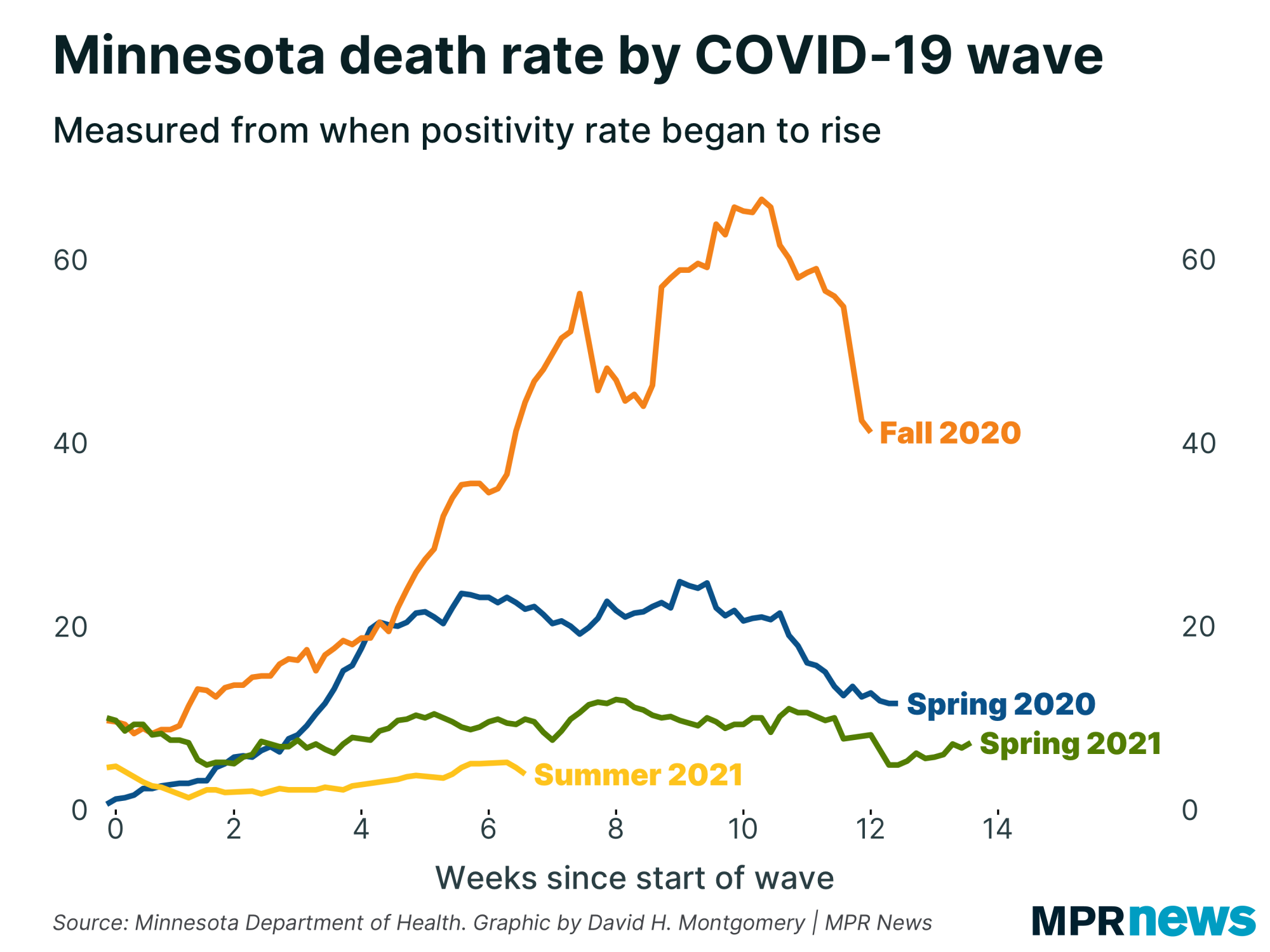
People who endorse this argument are also drawn to graphs like this one, showing the diminishing mortality of COVID-19 over the past year, even as cases continue to spread: |
| |
|
|
All three of these theories have strong arguments behind them! But it's important not to fall prey to confirmation bias in deciding which one we think is true.
For example, after looking at the data, my gut is inclined toward the optimistic argument, that cases will peak soon, and never rise to current levels again. But I also know that's what I want to be true, and we should always be skeptical any time our judgment about what will happen matches up so conveniently with our judgment about what should happen. (Also, I've been burned before — after each of Minnesota's past three waves, I nurtured hopes to varying degrees that this was it, it'd be smooth sailing from here on out. Gonna keep my powder dry this time around!)
Similarly, belief in the seasonal argument seems to be correlated to a striking degree with opposition to lockdowns and mask mandates. If the virus is driven more by seasonal factors than human policy, then those annoying interventions are useless and we should just live freely. Again, this might be right — but it happens to coincide suspiciously with what many of its backers want to be true.
Pessimists can fall prey to their own fallacies, too: I've seen many people predicting imminent doom who take every COVID update with bad news as proof that the future wave is coming — but dismiss any update with good news as unreliable or wrong because the coming disaster is inevitable. The result: a theory that's unfalsifiable, at least in the short term.
I'm not saying here that all of these arguments are equivalent — just urging a call for a bit of epistemological modesty as we deal with a pandemic that a year and a half in we still only half-understand. Form theories, but adapt them in response to data, and beware of confirmation bias. |
| |
|
|
Below, I'll explore a few more stats about Minnesota's COVID-19 outbreak. If you want to learn more, I also recommend these other articles:
| | |
|
|
| What's happening with breakthrough cases? |
For the majority of Minnesotans who are fully vaccinated right now, one of the most worrying aspects of the current delta wave are the "breakthrough" cases where people who had already been vaccinated get sick.
There's a fair amount of research on this topic that I'm not going to get into here, in part because this newsletter is already long enough! Instead, I'm going to focus on what Minnesota's pretty limited data shows about breakthroughs.
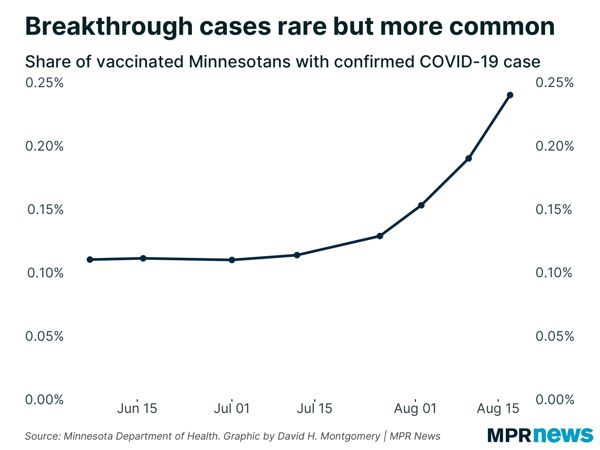
For some time now, Minnesota has produced weekly reports on the number of cases, hospitalizations and deaths from vaccinated people, along with the count of people who were fully vaccinated as of the date of the report.
As is often the Minnesota Department of Health's wont, they only post cumulative data, not a weekly time series. So I've had to construct my own time series by compiling their weekly reports since May.
If you compile this data, you can see that until about a month ago, only about 0.1 percent of vaccinated Minnesotans had had a confirmed COVID-19 case. Since then, that's more than doubled, to just short of 0.25 percent. (In fraction terms, it's gone from 1 in 1,000 to 1 in 400.) |
| |
|
|
But how alarming is that, really? After all, the number of breakthrough cases have gone up a lot at the exact same time that the number of non-breakthrough cases have shot up, too. If vaccines have a roughly fixed chance of preventing COVID-19 infection, then we'd expect breakthrough cases to rise roughly in tandem with overall cases.
We can roughly say that that's what has happened, but it's hard to say much more than that with the extremely limited data the Minnesota Department of Health provides.
Here's the problem: their weekly reports are just the number of breakthrough cases MDH knows about when they compile their report. They're not broken out by the data the sample was collected, or any other way that lets us accurately compare the number of breakthrough cases to the number of non-breakthrough cases.
In fact, when I reached out to MDH's data people asking for advice on how to do this, I was very strongly urged to not attempt it.
I'm going to do it anyway!
Just take what follows with a huge grain of salt, because the numbers I'm comparing to each other are not necessarily apples-to-apples. But I think this can give us a rough picture of what's going on right now, even with these shortcomings.
Those caveats out of the way, here's what I did. I took those weekly counts of breakthrough cases, and matched them up to the number of total cases reported about that time. I also took their weekly counts of fully vaccinated individuals and used that to calculate the number of non-fully vaccinated individuals.
Then, rather than just calculating the share of cases among vaccinated people, I also calculated the share of cases among unvaccinated people — and compared the two numbers.
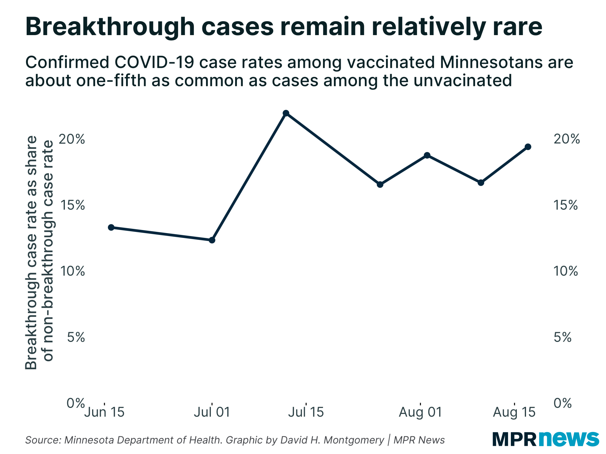
So in the most recent report, on Monday, Minnesota had 1,572 new breakthrough cases out of a fully vaccinated population of about 3 million people. We also had a bit over 7,000 newly reported non-breakthrough cases out of an unvaccinated population of around 2.6 million. In other words, around 0.27 percent of unvaccinated people got COVID, and around 0.05 percent of vaccinated people did.
The breakthrough rate, put differently, is around 20 percent of the non-breakthrough rate. Another way of saying that — again, being incredibly rough and sloppy here — that the vaccines have about an 80 percent effectiveness here.
Don't take that number too literally. The data here is far too rough to actually calculate vaccine effectiveness in Minnesota. What I want you to take away from this is the trend over time — each week, Minnesota's roughly calculated vaccine effectiveness has bounced around a bit, but hasn't changed that much, and certainly not in a single direction. That is, there's no sign the vaccines are getting less effective. |
| |
|
|
To reverse my earlier question: how much comfort should you take in that? Here we need to distinguish relative risk and absolute risk.
The relative risk for vaccinated people and COVID has remained stable and quite low, though not zero, even as cases have escalated. But the absolute risk has risen — if the vaccine gives you a 90 percent chance of not getting infected by COVID-19, you're still a lot more likely to get infected as cases rise than you were when cases are low, just less likely than someone who's not vaccinated.
Both are important factors to consider.
For more analysis of this, based on actually good data provided by Israel, check out this fascinating article by Jeffrey Morris. |
| |
|
|
Minnesota's racial vaccination gap
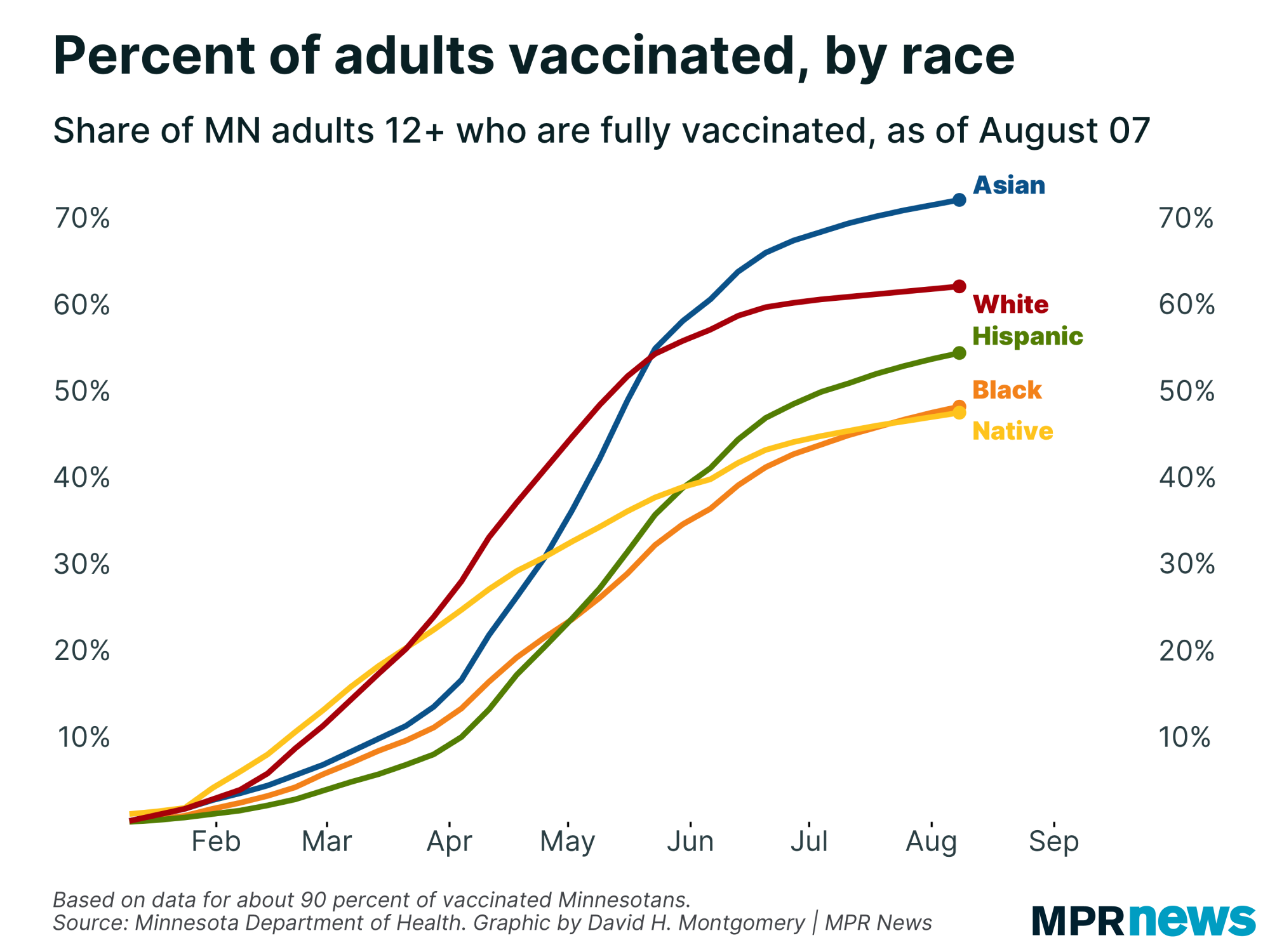
| | I've reported on a number of occasions about how white and Asian Minnesotans have been much more likely to be vaccinated than other racial or ethnic groups, especially Black and Native American Minnesotans. |
| |
|
|
But I wanted to dig deeper into this stat, because Minnesota's population is not uniformly distributed. People of color are much more likely to live in the Twin Cities metro, which is also the part of the state with the highest overall vaccination rates. This confluence of high overall rates and a concentration of subgroups with low overall rates had me intrigued!
It took a month to get this data back from the Health Department, but it finally arrived late last week. And it's extremely interesting.
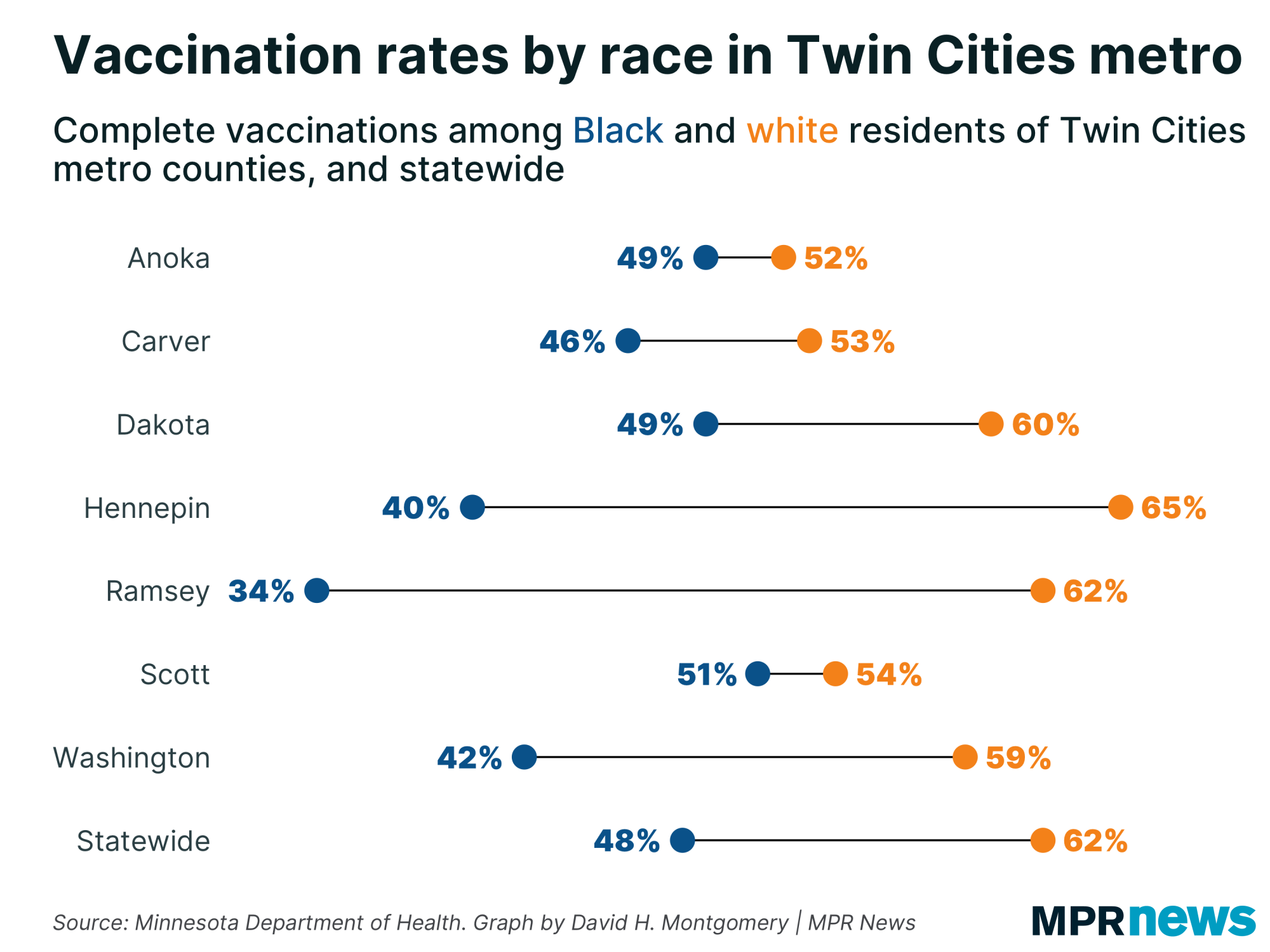
Below you can see a chart showing the vaccination rate for Black and white residents (for simplicity and clarity) of the seven counties in the Twin Cities metro, along with statewide figures. The most striking data? The absolutely massive racial gaps in Hennepin and Ramsey counties, where white residents are 25 percentage points more likely to be fully vaccinated than Black residents. There are also sizable racial gaps in the large, relatively urbanized suburban counties of Dakota and Washington. Meanwhile Anoka, Scott and Carver have higher vaccination rates among Black residents, but lower rates among white residents. |
| |
|
|
Unfortunately, this data — extrapolated from ZIP codes to counties, a bit of a fuzzy process — didn't let me calculate a "rest of Minnesota" line here, so you'll have to make do with "Statewide" as a comparison.
You might also be surprised that vaccinations among the disproportionately liberal and educated white populations of Hennepin and Ramsey County are barely in line with the statewide figures. I was too, until I remembered the powerful correlation between age and vaccination. Greater Minnesota's population is much older than the Twin Cities metro, which will lead to a relatively higher vaccination rate. If I had the data to control for age, my hunch is that a white 30-something in Hennepin County is significantly more likely to be vaccinated than a white 30-something outside of the metro.
It's possible adjusting for age could explain some of the low vaccination rates of Black residents of the inner metro, though the median age of Black Hennepin County residents is 27.9, higher than Anoka, Carver, and Scott counties and equal to Washington.
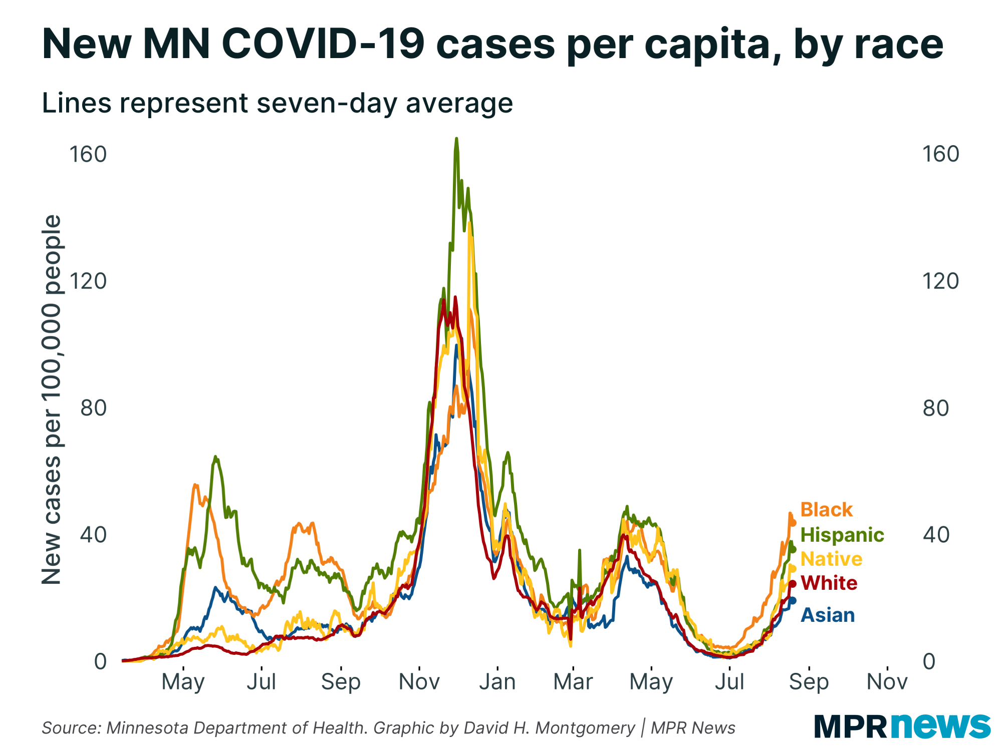
How does this compare to case rates? Well, it's been a striking feature of this current wave that Minnesota's Black community has consistently recorded the highest per capita case rates: |
| |
|
|
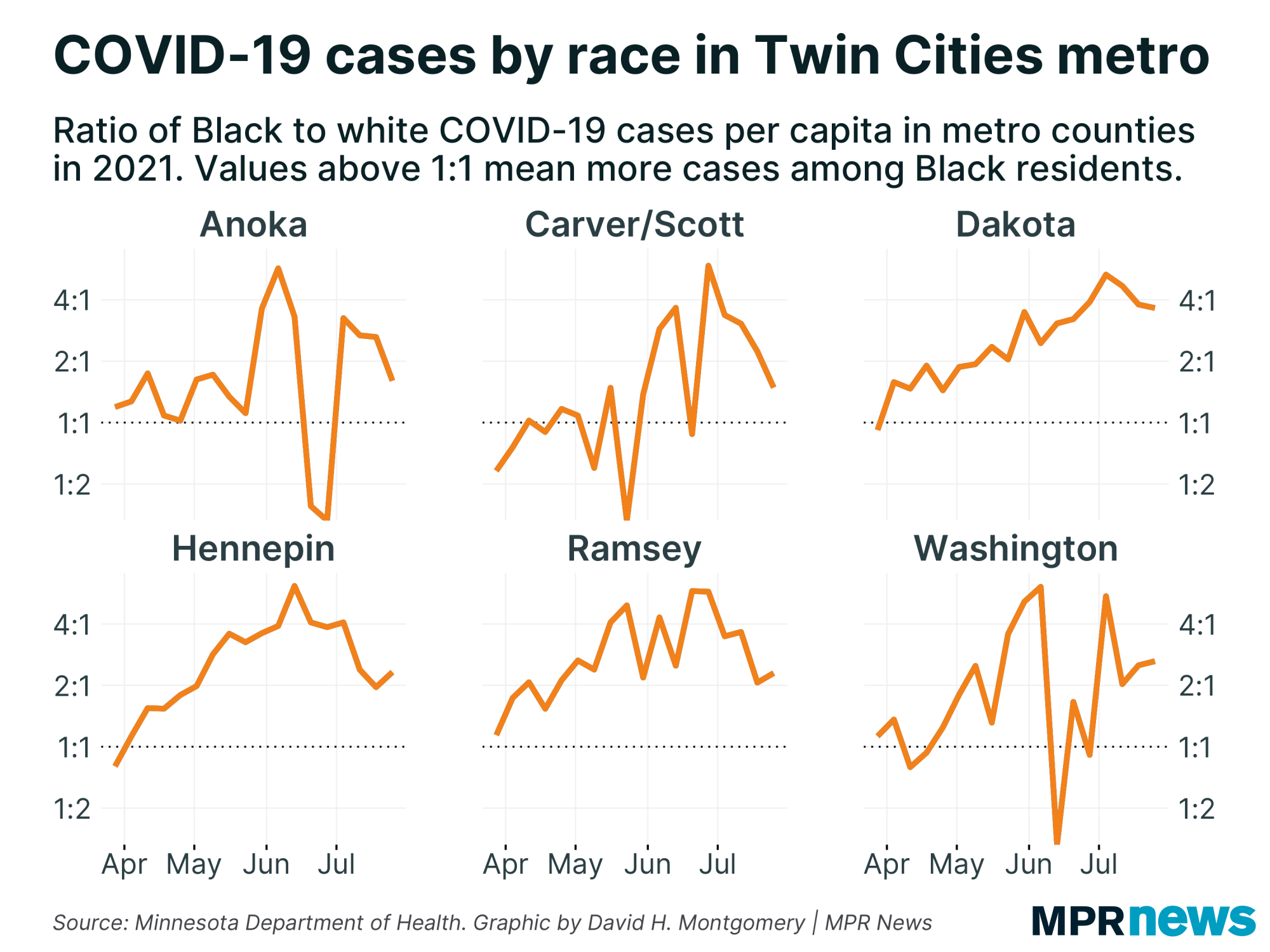
| The chart below doesn't have a super clear narrative in context of the earlier chart on vaccination rates. It's certainly the case that these metro counties have generally shown higher cases per capita among Black residents than white residents, but it's not obviously the case that Hennepin and Ramsey — with the biggest vaccination gap — have had a bigger racial case gap. |
| |
|
|
| Sometimes with data analysis, you just have to shrug your shoulders and say, "This is more complicated than I hoped. This calls for further study." | | |
|
|
What's happening next?
| Next week I'll check back to update you on if Minnesota's wave has, in fact, peaked!
Thanks for subscribing to this newsletter and for all of you who've sent me your feedback. As always, if you like this newsletter, please share it and the sign-up link with others who you think might enjoy it.
— David |
| |
|
|
Preference Center ❘ Unsubscribe You received this email because you subscribed or it was sent to you by a friend. This email was sent by: %%Member_Busname%%
%%Member_Addr%% %%Member_City%%, %%Member_State%%, %%Member_PostalCode%%
  |
|
|
| | |