%%[ SET @ViewURL = view_email_url
SET @ListID = ListID SET @SubChecker = _subscriberkey SET @EmailName = EmailName_ if @SubChecker == "ask@mpr.org" then insertde('ENT.newsletter_archive_2','VAWPURL',@ViewURL,'SubscriberKey',
@SubChecker,'EmailName',@EmailName,'Date',NOW(),'ListID',@ListID) ELSE endif ]%% |
%%[ if _MessageContext != "VAWP" then ]%% %%[ endif ]%% |
| Welcome back to COVID in Minnesota TODAY, an email newsletter from MPR News about understanding the latest developments in Minnesota's COVID-19 outbreak. | | |
|
|
Minnesota's messy COVID statistics may finally be coming back into focus, but we're still dealing with the hangover that makes it hard to tell exactly what happens.
As near as I can tell through the haze, everything looks encouraging for us. I'll try to decipher that as best I can for you here today. | |
|
|
|
Three things to know
| - Minnesota might be finally getting through its month of severely lagged COVID case data
- Sample date data suggests Minnesota might have seen its omicron wave peak in mid-January, but we don't yet have good data to distinguish between the metro area and the rest of the state here
- Preliminary data from the start of the omicron wave highlights rising breakthrough infections — but falling prevalence of breakthrough hospitalizations and deaths
|
| |
|
|
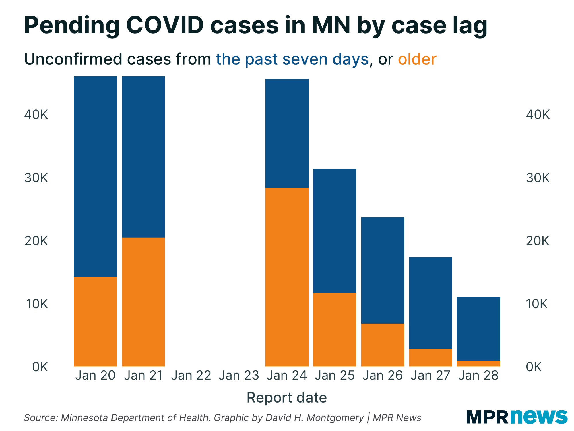
I'll start off with the big picture about Minnesota's data mess — thankfully now a much smaller data mess. Back on Monday, the Minnesota Department of Health had more than 40,000 unprocessed positive test results — two-thirds of which were more than a week old.
By Friday, thankfully, that was down to around 10,000 unprocessed cases, and most of those were from the past week. |
| |
|
|
It's also worth noting that before our little data crisis of the past month, it was totally normal for the Minnesota Health Department to have a certain number of unprocessed cases from the past week. We don't know how many unprocessed cases was normal, but there's a reason that since the beginning of the pandemic, sample-date data has tended to exclude the most recent week as incomplete. That's because it tended to take up to a week for almost all of a given day's tests to come in. (Usually, in fact, it was less than this — around three to four days.)
As a result of this processing of old cases, we've seen the average lag time for newly reported cases fall from nearly 10 days on Monday to around six days Friday.
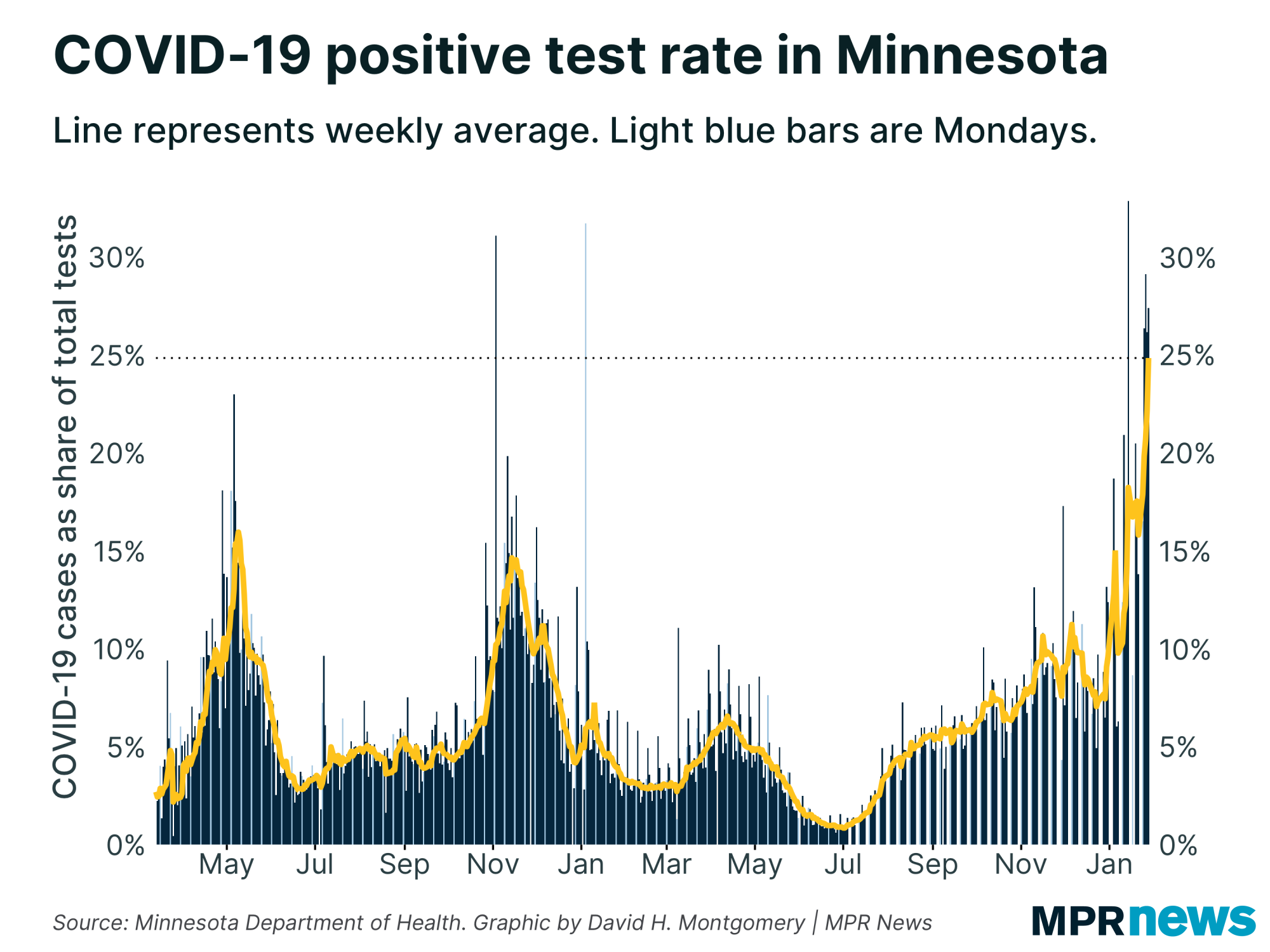
The flip side of all this: The new cases reported this week included many thousands of old cases from this backlog, as it was cleared. So if you track data by report date — as I did for much of the pandemic — you might think Minnesota's COVID-19 outbreak was the worst it has even been. By report date, our average positivity rate over the past seven days is a stunning record 25 percent: |
| |
|
|
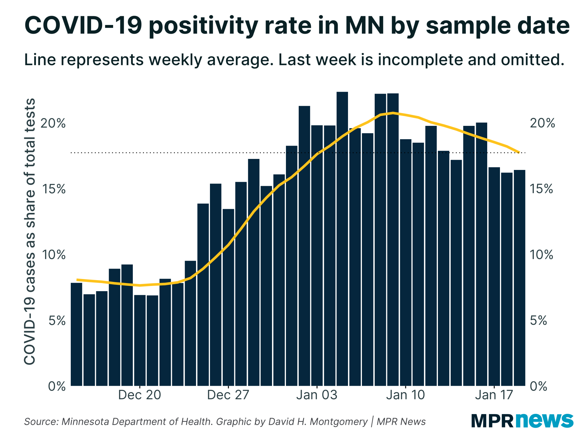
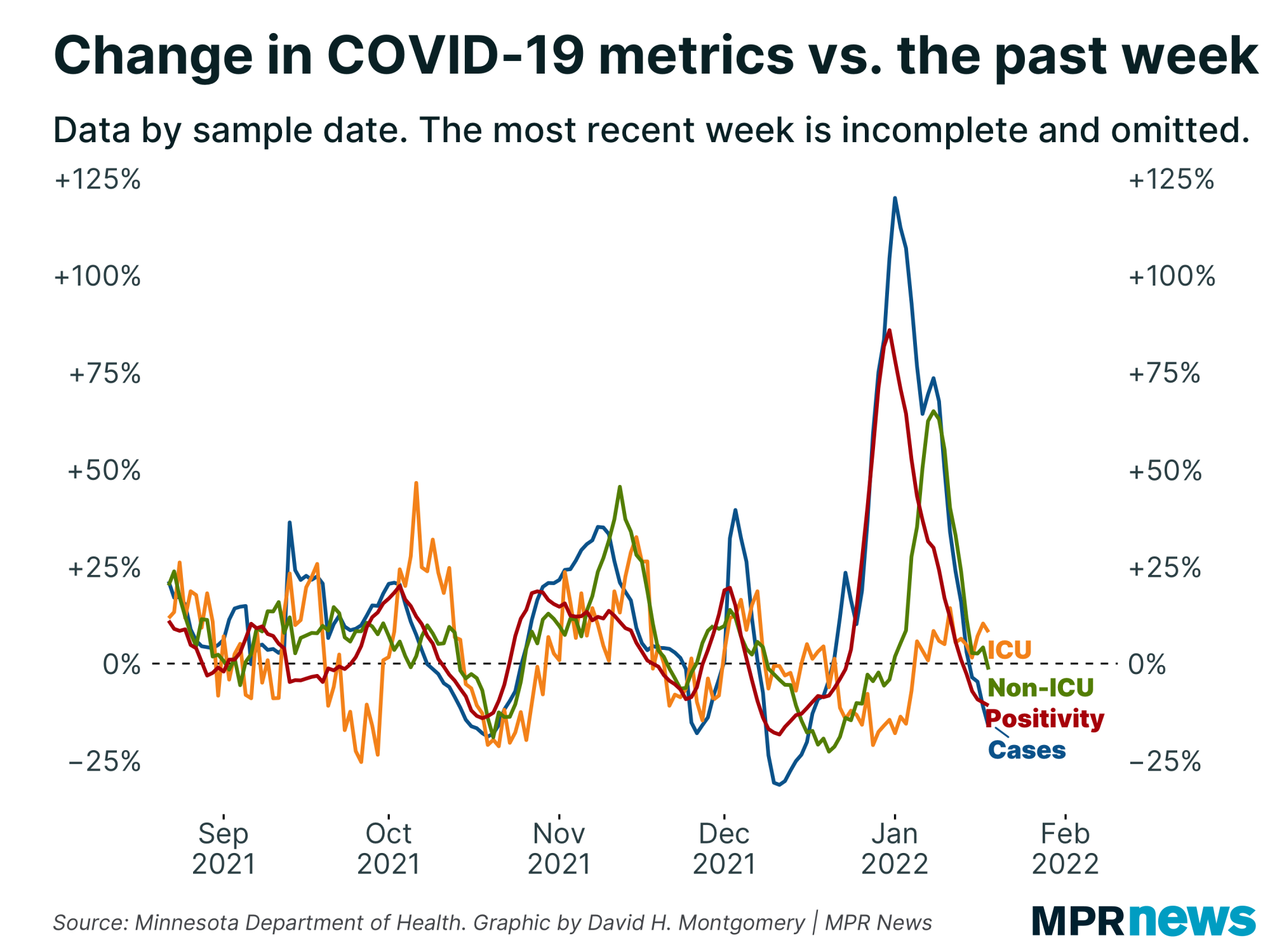
| But this is heavily misleading. By all indications, the week of Jan. 24 is absolutely not the worst stretch of the pandemic so far for Minnesota, by cases or positivity. When we look at when tests were actually taken, rather than merely reported, Minnesota's peak looks to be not Jan. 28, but around Jan. 10 — more than two weeks earlier. |
| |
|
|
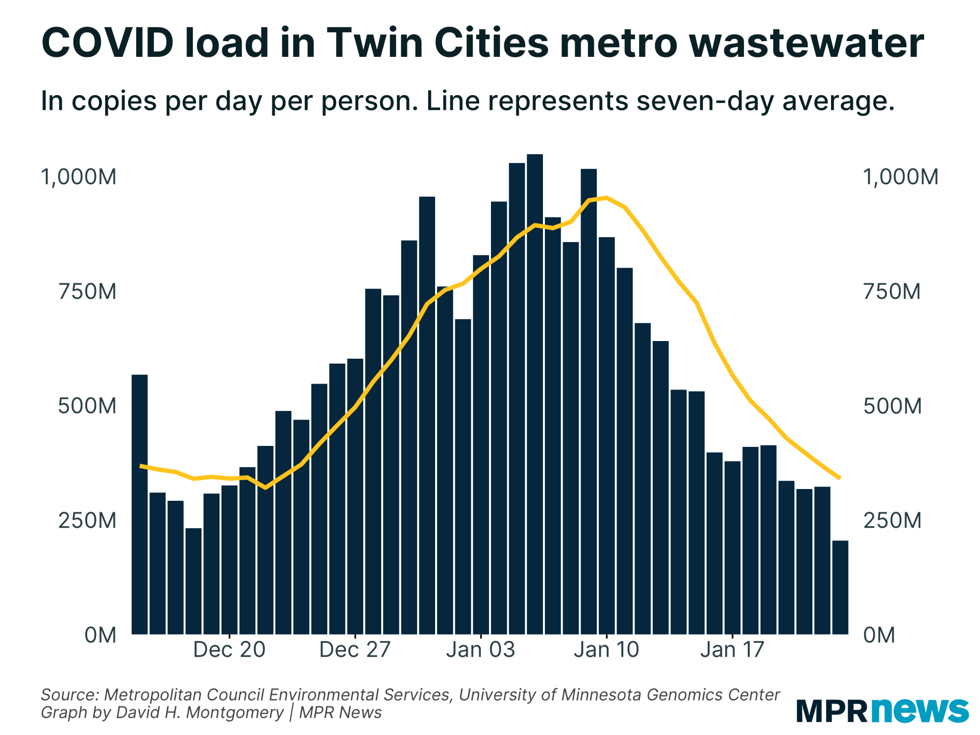
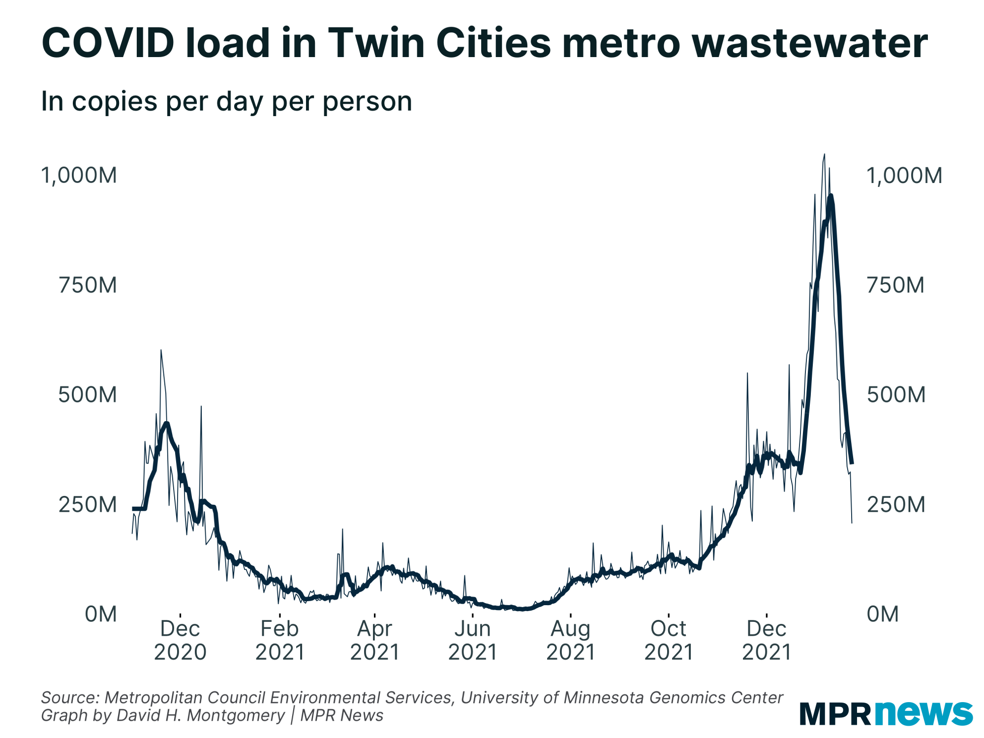
| Attentive readers might have sat up a bit at that "Jan. 10" date. If it sounds familiar, that's because that's also the date at which COVID-19 concentrations in Twin Cities wastewater peaked. | | |
|
|
Those two charts look a lot alike! The one exception: the decline in wastewater levels in the metro area is much steeper than the statewide positivity rate.
But that's not necessarily surprising. Remember that the wastewater data only covers part of the Twin Cities metro area, about 2 million people out of Minnesota's 5.7 million people. And remember that the omicron wave hit the metro area first, and only a few weeks later hit rural Minnesota. So it's possible that steep case declines in the metro area after Jan. 10 were partially offset by case increases in greater Minnesota.
Unfortunately, the only data on cases by county we have are by report date — not terribly useful for trying to isolate a trend that may have begun in the Twin Cities metro area. I've requested cases by sample date by county from the Health Department, and was told just now that it should be ready sometime next week.
There are plenty of reasons why this interpretation of the data could be wrong. Goodness knows we've seen a lot of ways that our data can be wrong in the past month. But every bit of information we have suggests that whatever data lags we're suffering now just aren't affecting case counts from two to three weeks ago any more. Unless a lab somewhere is sitting on thousands of unreported cases (it's happened before!) our data on cases from Jan. 10 cases is probably pretty complete.
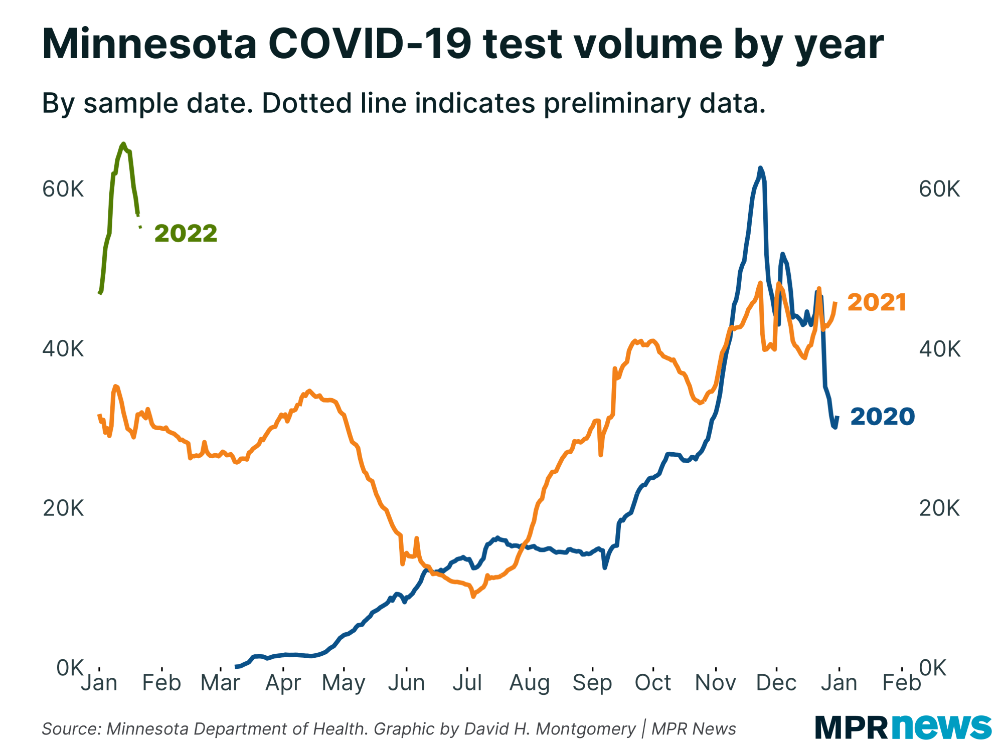
Another sign of support for this theory that Minnesota already peaked — or at least, that the metro did — comes from test counts.
There's a complex chicken-and-egg relationship between case counts and test volume: Because not everyone who gets sick gets a verified test, increasing tests tends to find more cases, and lowering tests tends to find fewer cases. But people are also more likely to get tested when more people are experiencing COVID-like symptoms (or came in contact with people who are).
However those two factors play out, we would expect to see falling test volume when Minnesota is recovering from a wave. And that's exactly what appears to have happened.
By sample date, test counts peaked around Jan. 13, just a few days after positivity and cases did on Jan. 10. |
| |
|
|
Unlike case counts, data on total tests conducted is processed nearly automatically and never suffered major lags this past month. So there's little reason to think this decline is statistically fishy. Starting in mid-January, Minnesotans started taking fewer COVID-19 tests, right about the same time that case counts started falling, that positivity rate started falling, and that wastewater concentration's in the state's largest metro started falling.
All this adds up to suggest that Minnesota really has seen a case peak, which we have to assume is really a peak in the metro. Hopefully next week we'll get more of a sense about how things are going in the rest of the state.
I want to circle back to that wastewater data for a moment because it has something else important to tell us. Here's wastewater concentrations in the metro area over the entire pandemic: |
| |
|
|
If you follow the thin line there, representing actual daily measurements (versus the thick line plotting the seven-day average), you can see that the most recent data (as of Jan. 23) was just over 200 million copies per day per person. That would be the lowest level recorded since early November, and with no sign of leveling out.
This is important because it suggests an answer to the question of what's next for Minnesota. Remember that during our delta wave, we had several false peaks, where cases fell only to turn around and rise again, or level out at a plateau.
If this wastewater data is accurate, it suggests that we're not going merely go back to the COVID levels we saw back in mid-December.
If we're really lucky, they'll keep falling down to the lows we saw back in February 2021, or even the halcyon days of June 2021. But only time will tell. |
| |
|
|
Below, I'll explore a few more stats about Minnesota's COVID-19 outbreak. If you want to learn more, I also recommend these other articles:
| | |
|
|
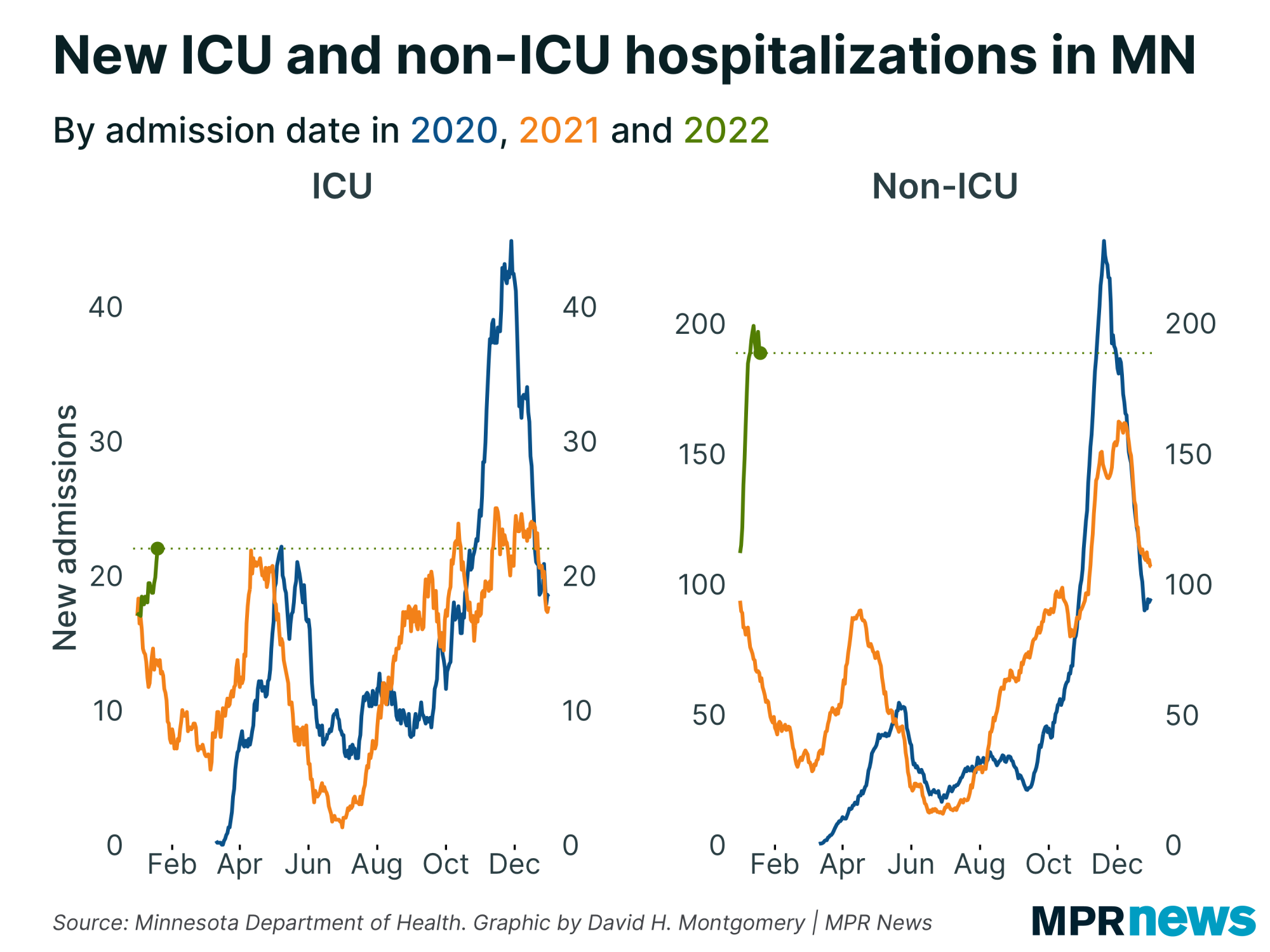
| Mixed messages on hospitalizations | | What's going on with hospitalization rates in Minnesota? Well, if you look at admission rates, it can seem concerning — non-ICU admissions are high and at best slightly down from their peak, while ICU admissions are rising to near the highest levels we saw last fall. |
| |
|
|
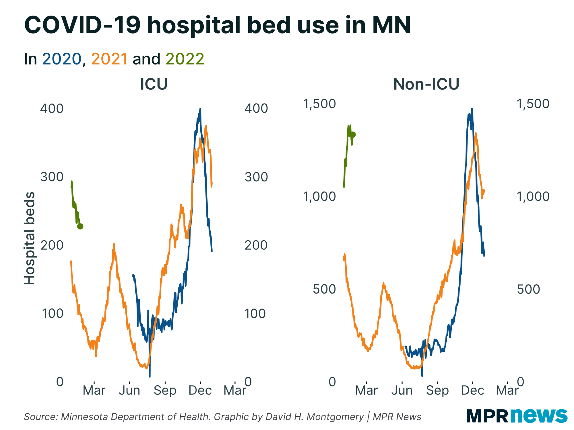
| Data by hospital bed use tells a very different story, at least for the critical category of ICU beds. While ICU admission rates are rising, ICU bed use is falling. | | |
|
|
So how can admissions be going up while bed use falls? One possible answer is that there's a data issue.
Another is that the prior cohort of ICU admissions is being discharged (or dying) at high rates, rates that are outpacing even a rising rate of admissions. (Discharges could also be opening up scarce ICU beds for people who were already hospitalized.)
There's one other thing worth noting here. With reports that omicron might be milder, I took a look at the relative increase we've seen in hospitalizations vs. cases.
Throughout the pandemic, ICU and non-ICU hospitalizations have tended to rise by about the same proportion as cases and positivity rate have in waves, and fallen by similar amounts in recovery periods.
In our recent omicron spike, we saw that happen with non-ICU admissions, which shot up well over 50 in a week, in the same general neighborhood (though smaller) as positivity rate and case counts.
But ICU admissions to date this surge have never gone up more than 10 to 15 percent week-over-week, and usually single digits. |
| |
|
|
It's possible we're looking at this stat too early — after all, new admissions are increasing this week. And the fact that ICU beds were so full already when this wave started might have limited the ability of ICU admissions to rise. So what follows might be extremely premature.
But if we're lucky, we may be finally seeing the beginnings of the long-hoped-for "decoupling," where case counts can rise without leading to a subsequent surge in hospitalizations. We need to observe this longer, and probably see it replicate in a future outbreak, before we can become confident in the decoupling hypothesis. But this is the first sign in two years that this might actually be happening (however much some people have hoped for it or thought they were seeing it). |
| |
|
|
| Omicron nudges the breakthrough picture |
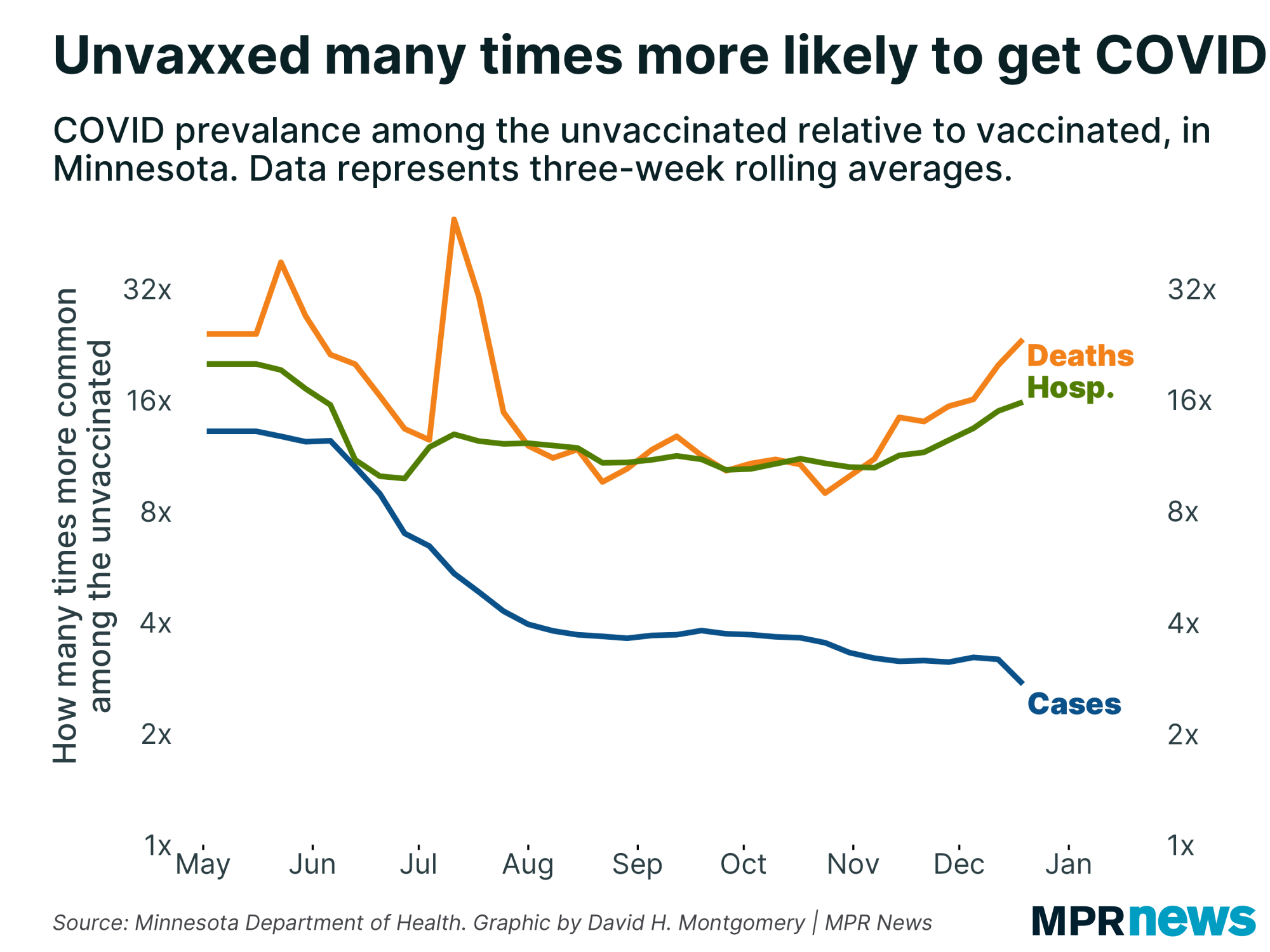
For months now I've been updating you on the latest developments in Minnesota's COVID-19 breakthrough stats, and the story has been pretty similar: fully vaccinated Minnesotans have been about three times less likely to catch COVID than non-vaccinated Minnesotans, and 10 times or more less likely to get serious cases that result in hospitalization or death.
This week we got another update in this data, which — with the one-month lag this data is subject to — brought us to a really interesting milestone. Cases from the week beginning Dec. 19 brought us to the beginning of Minnesota's omicron surge. And this change also shook up some of our long-observed patterns.
The good news: The relative protection of fully vaccinated Minnesotans has continued to rise. In the week beginning Dec. 19, the fully vaccinated were an enormous 27 times less likely to die from COVID-19 than the non-fully-vaccinated, up from 24 times the week before and 21 times the week before that. The relative protection against hospitalization has also risen, if more gradually.
But the relative prevalence of mere infection showed the opposite trend. For months now COVID has been about three to four times more common among the unvaccinated. In the first week of omicron, that dropped to just two times more common. |
| |
|
|
That's the split picture omicron appears to have brought, at least in this preliminary data (which matches observations from other places). Vaccines have never offered less protection against the possibility of being infected — but they've never offered more protection against the possibility of serious illness.
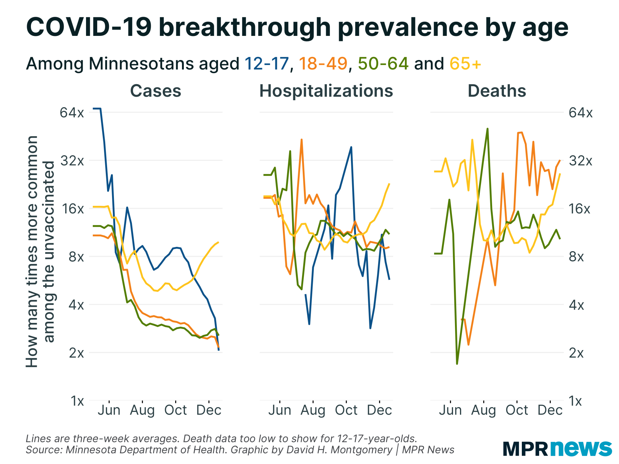
A few things complicate this. First, in Minnesota we unfortunately only have data on COVID status by whether someone is or isn't fully vaccinated. In an ideal world we'd have separate lines for completely unvaccinated, partially vaccinated, fully vaccinated, and boosted.
The second complicating factor is what's driving this under the hood. It's not the case that relative COVID risk is changing in a uniform manner. Instead, different age groups are seeing different changes, and the drivers appear to be the youngest and oldest Minnesotans.
Looking at breakthrough cases, for example, we've seen very gradual decrease in observed protection among working-age adults. Protection has plunged among teenagers, and has actually risen among seniors!
Meanwhile looking at deaths, the rising observed protection is being driven mostly by seniors, the most vulnerable age group. In the week beginning Dec. 19, Minnesota saw just under three COVID deaths per 100,000 vaccinated seniors, and it saw nearly 100 deaths per 100,000 unvaccinated seniors — a nearly 40-fold difference, and rising! |
| |
|
|
Note that the graphs are showing three-week rolling averages, so the figures you see there might not match up with the one-week figures I've shared with you in the text here.
Behind the dramatic divergence among seniors we have to add the caveat: Well over 90 percent of Minnesota seniors are fully vaccinated. So you've got a very small population of unvaccinated seniors who are suffering disproportionately here. And when you have really small populations, you can get pretty extreme ratios.
But the early indication is that while omicron might be better at infecting vaccinated people (and previously infected people, given the rising reinfection rate I've discussed here before), the vaccines appear to be extremely effective against the serious illness. |
| |
|
|
What's happening next?
|
Next week we'll get another dump of wastewater data, and also data on cases by county by sample date that should give us a clearer picture about how omicron is affecting different parts of the state. We'll also probably start to finally put our data headaches behind us, unless I've just jinxed us by saying this.
Thanks for subscribing to this newsletter and for all of you who've sent me your feedback. As always, if you like this newsletter, please share it and the sign-up link with others who you think might enjoy it.
— David |
| |
|
|
%%[ if _MessageContext != "VAWP" then ]%%
Preference Center ❘ Unsubscribe You received this email because you subscribed or it was sent to you by a friend. This email was sent by: %%Member_Busname%%
%%Member_Addr%% %%Member_City%%, %%Member_State%%, %%Member_PostalCode%%
  |
%%[ endif ]%% |
|
| | |