%%[ SET @ViewURL = view_email_url
SET @ListID = ListID SET @SubChecker = _subscriberkey SET @EmailName = EmailName_ if @SubChecker == "ask@mpr.org" then insertde('ENT.newsletter_archive_2','VAWPURL',@ViewURL,'SubscriberKey',
@SubChecker,'EmailName',@EmailName,'Date',NOW(),'ListID',@ListID) ELSE endif ]%% |
%%[ if _MessageContext != "VAWP" then ]%% %%[ endif ]%% |
| Welcome back to COVID in Minnesota TODAY, an email newsletter from MPR News about understanding the latest developments in Minnesota's COVID-19 outbreak. | | |
|
|
Last time I wrote about the early signs that Minnesota — or at least the Twin Cities — was beginning an omicron-driven COVID surge.
The subsequent week and a half has borne that out — and how.
Unfortunately, right at the time we care about it most, our data has become less reliable than it has been in more than a year.
Fortunately, I just got access to a dataset I've been wanting for a very long time — a dataset that can help provide that early look at out outbreak that case counts increasingly struggle with. That's right — in this newsletter, I finally got data on what we can learn about COVID from Twin Cities poop.
Read on for all of this. |
| |
|
|
Three things to know
| - Big delays in processing COVID tests are clouding our ability to tell what's happening right now
- Minnesota's omicron surge is in full swing, with new records being set for cases and positivity rate
- Samples from the Twin Cities' wastewater plant provide another way to measure COVID prevalence
|
| |
|
|
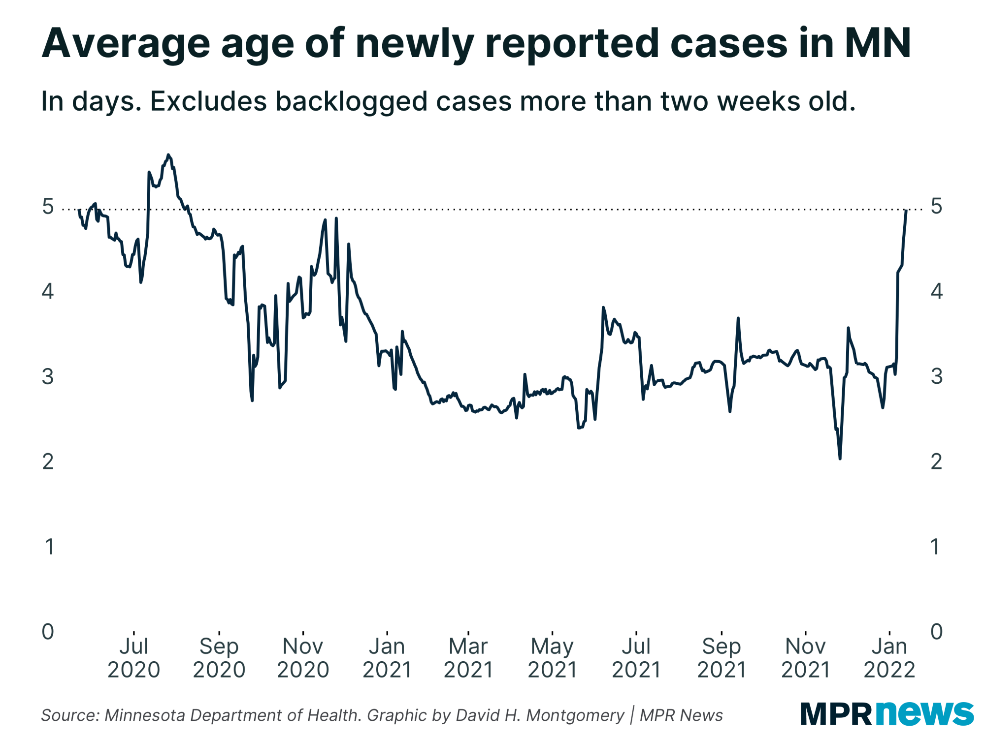
I optimistically thought that getting past the holidays would mean a return to normal COVID data. That turned out to be a big nope! (And next week there's no data on Martin Luther King Day, so the holiday cycle will start again.)
Right now Minnesota is experiencing its most significant testing delays in over a year.
There's always going to be some lag in calculating COVID-19 metrics — it usually takes at least 24 hours to process a PCR test, then the lab has to collect the data and send it to the Minnesota Department of Health, which then needs to process it before releasing it every workday at 11 a.m.
But for most of 2021, this delay averaged about three days from when the test was taken to when it was released.
Right now? We're averaging about five days, and rising. |
| |
|
|
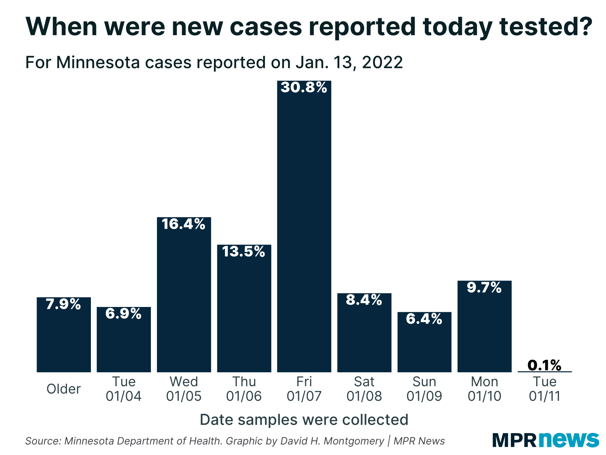
| As an example, today's report included 11,500 new cases. Most of those cases were from tests conducted late last week. | | |
|
|
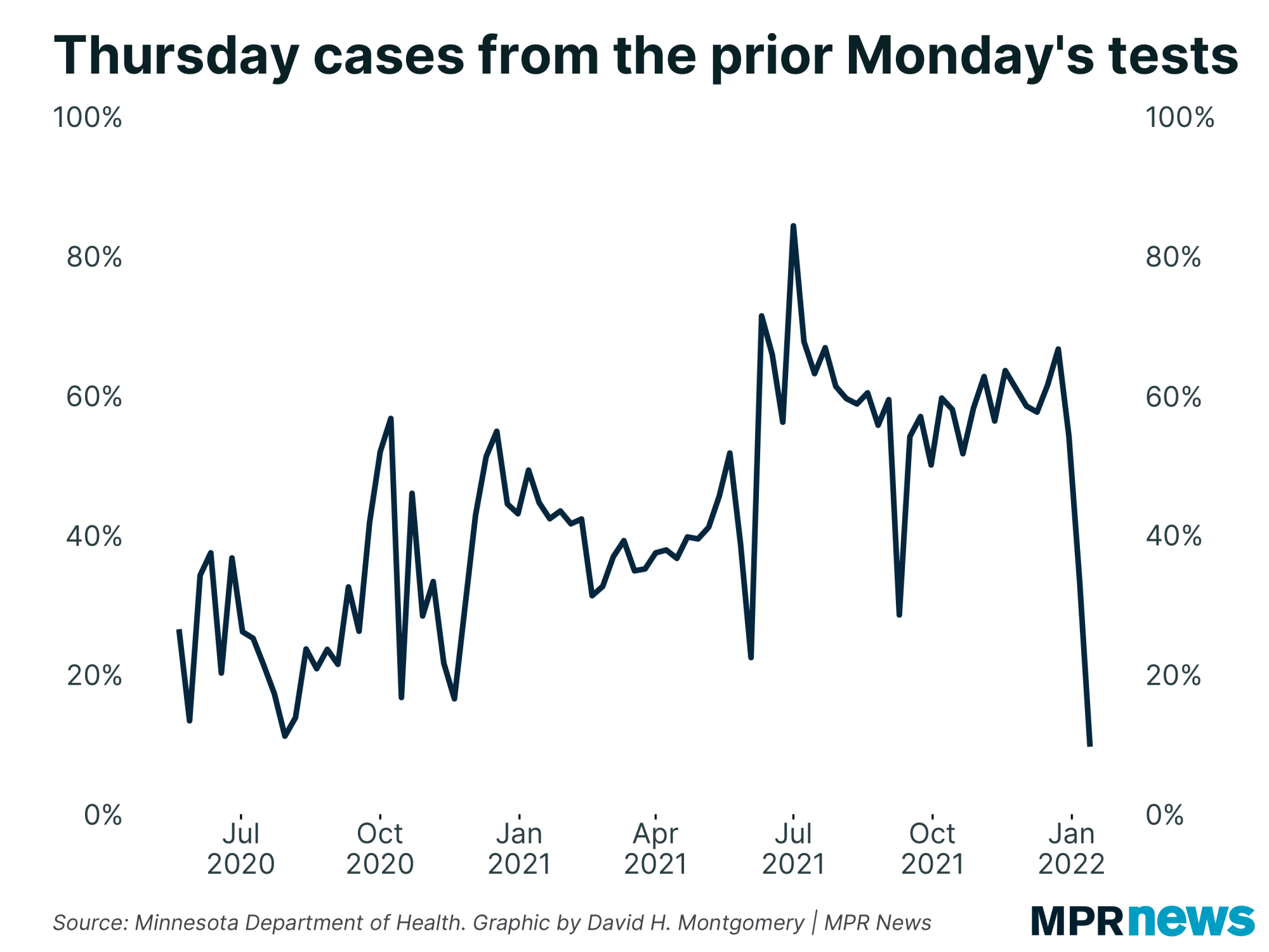
| That's not normal! Thursdays are usually the day when we start to get cases from the prior Monday. For the past year, about 60 percent of cases reported on Thursdays have typically been from that Monday. Today was less than 10 percent. | | |
|
|
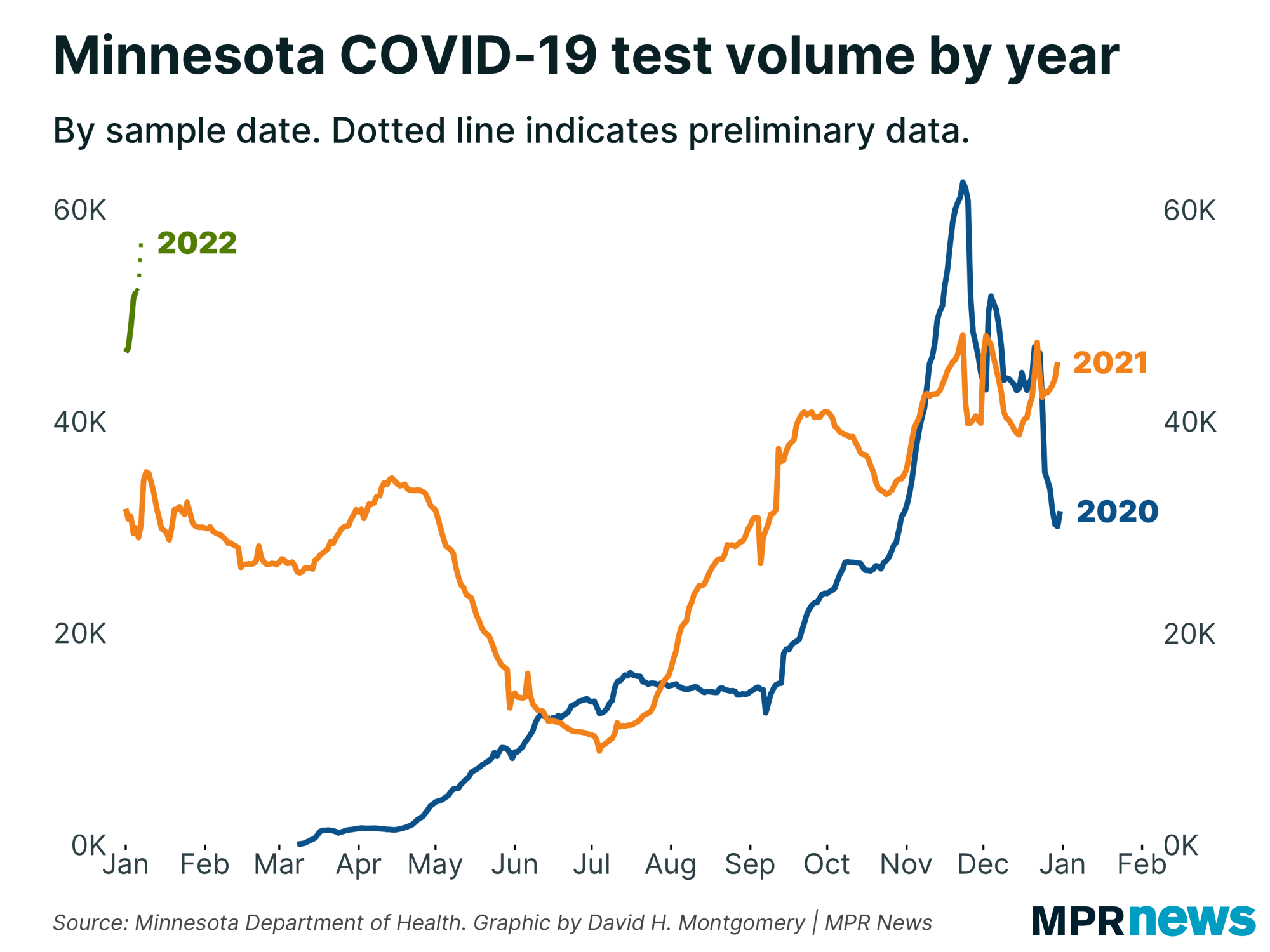
| Why this delays? Well, lots of people are getting sick or getting exposed, and thus are seeking tests — testing volume has spiked to near record highs, as near as our lagged data can tell us. | | |
|
|
That's put new strain on the system. Meanwhile, some of those thousands of people who are getting sick are people who work at COVID testing labs. So at the same time an unprecedented flood of tests are being taken, labs' ability to process them is sharply impaired.
And on top of that, a mess-up in processing PCR test data over the holidays created a bunch of backlogged tests and cases last week.
All this lag means we really have no idea what's happening with COVID-19 in the past seven days. The data is so lagged and incomplete right now it's frankly misleading to use data of any sort until a week or so has passed. Hopefully we get past this soon and are able to get a more current look at what's going on.
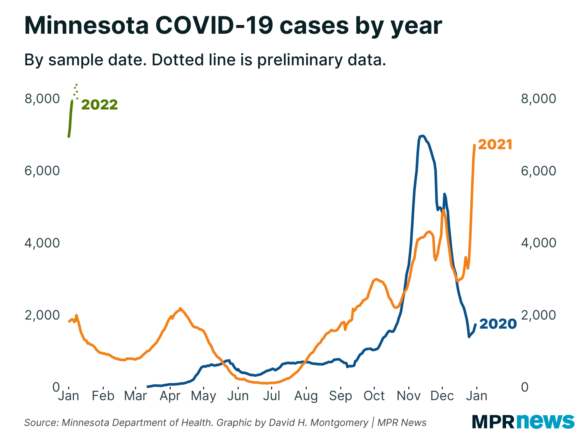
In the meantime, here's what we do know. As of the first week in January, COVID-19 cases surged to record highs. |
| |
|
|
And remember this doesn't include at-home rapid tests.
Now, some of this is explained by the really high testing volume we see now. But only a little. Minnesota's positivity rate a week ago was only tied for the record, rather than breaking it. And it was still rising. | |
|
|
|
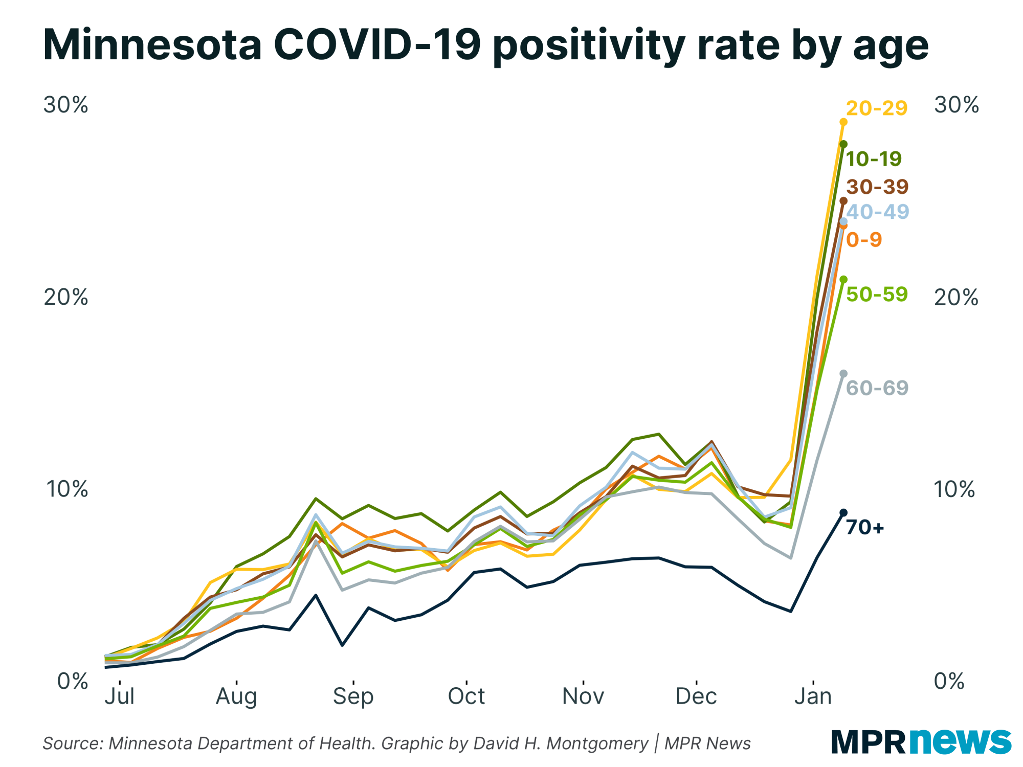
| Our under-the-hood data is, if anything, scarier. Take a look at this chart of positivity rate by age group. | | |
|
|
Nearly 30 percent of tests for 20-somethings are coming back positive. Every age bracket under 60 has positivity rates north of 20 percent. This is enormous.
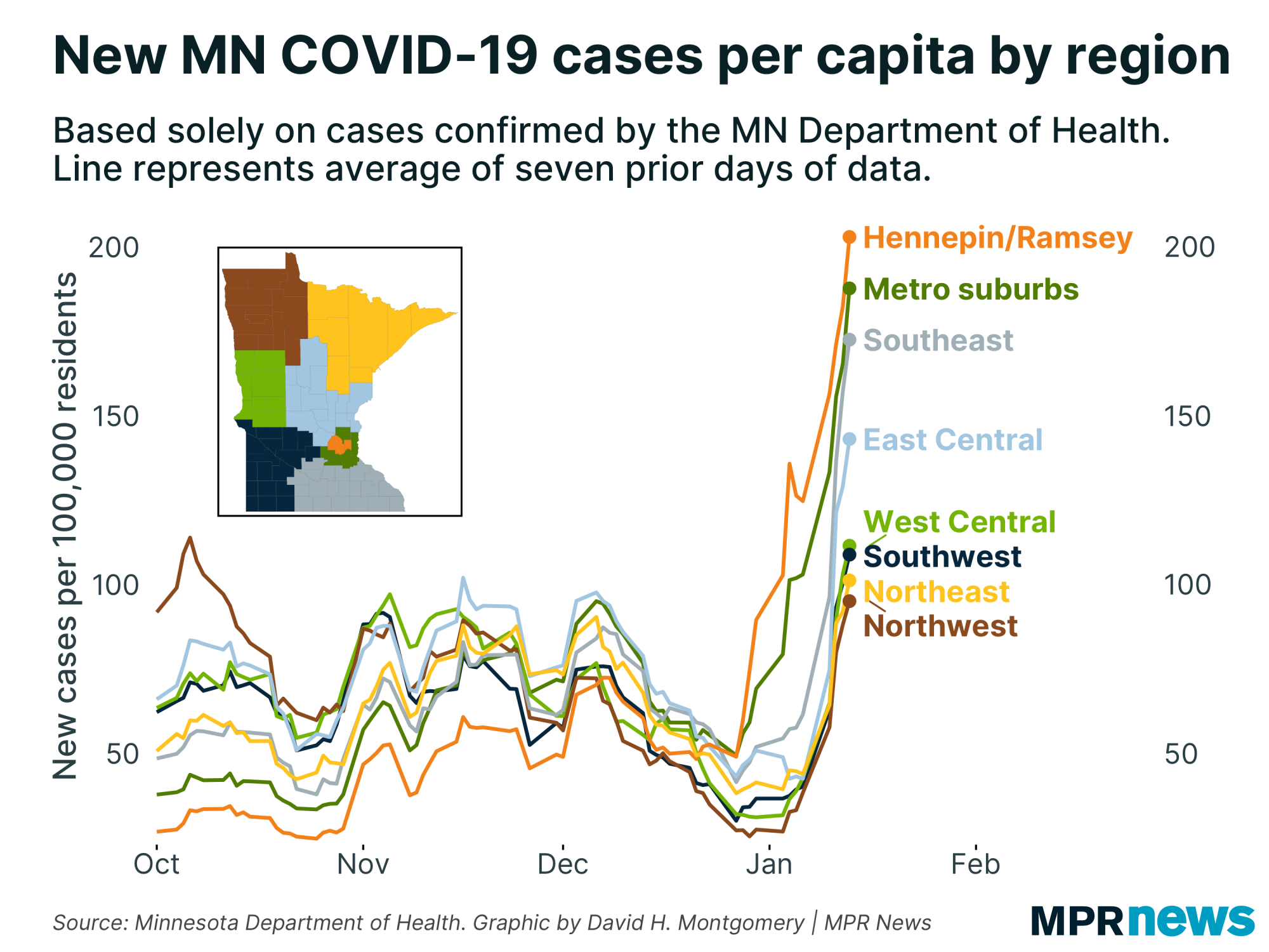
Our data on cases by geography are unfortunately messed up by some backlogged data, so don't take the values here literally. But even setting aside the backlogs, one thing is clear: what started as a surge in the Twin Cities metro area is now happening everywhere in Minnesota (though least severely, so far, in western Minnesota). |
| |
|
|
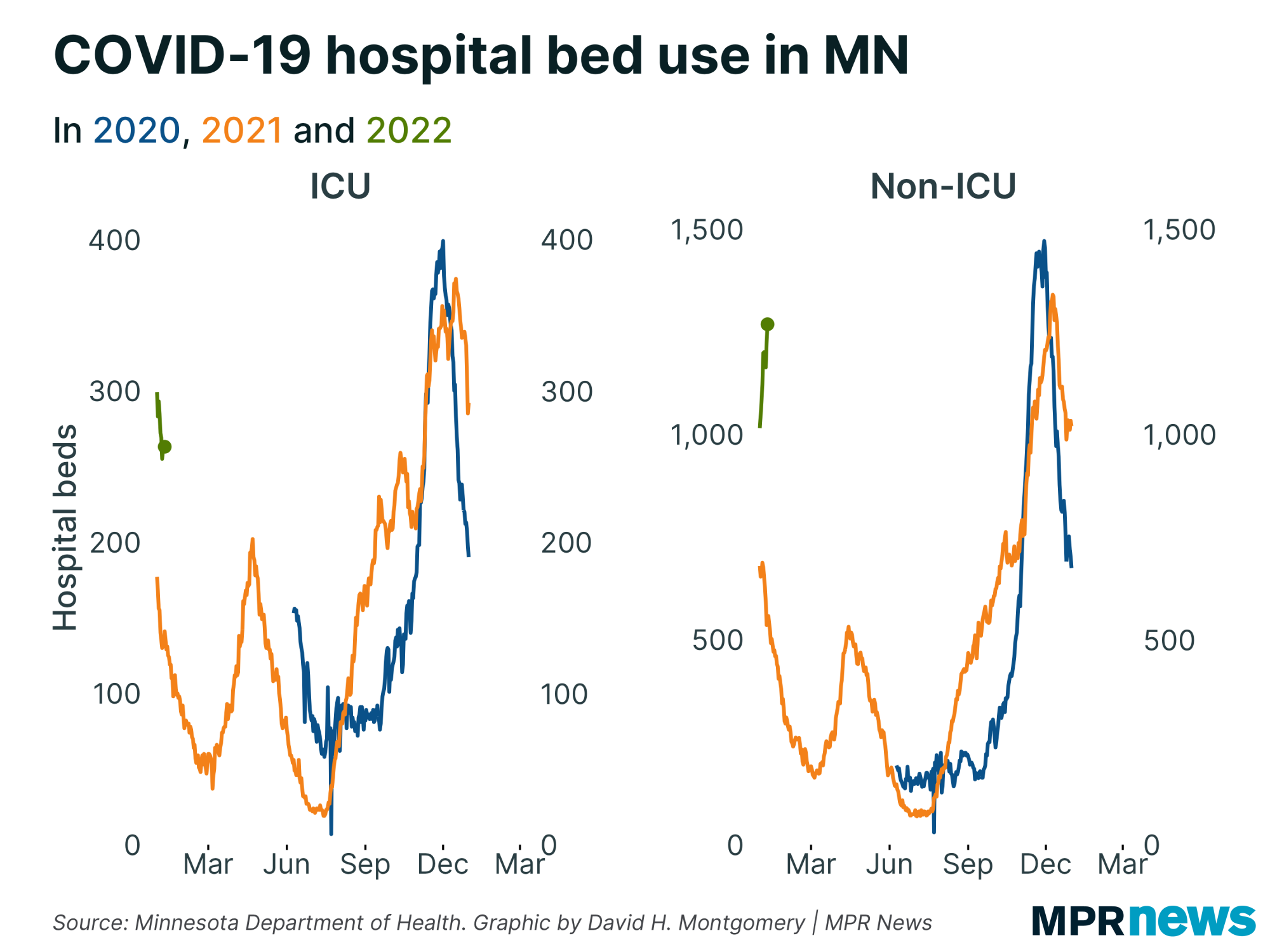
Last time, cases had started to rise but hospitalizations hadn't. This prompted some hopes that we were seeing a "decoupling" where cases would rise but — due to a milder variant hitting a vaccinated population — hospitalizations wouldn't.
It was a good, optimistic theory. Sadly, as has happened to a lot of good, optimistic theories this pandemic, it was disproven by just waiting a while.
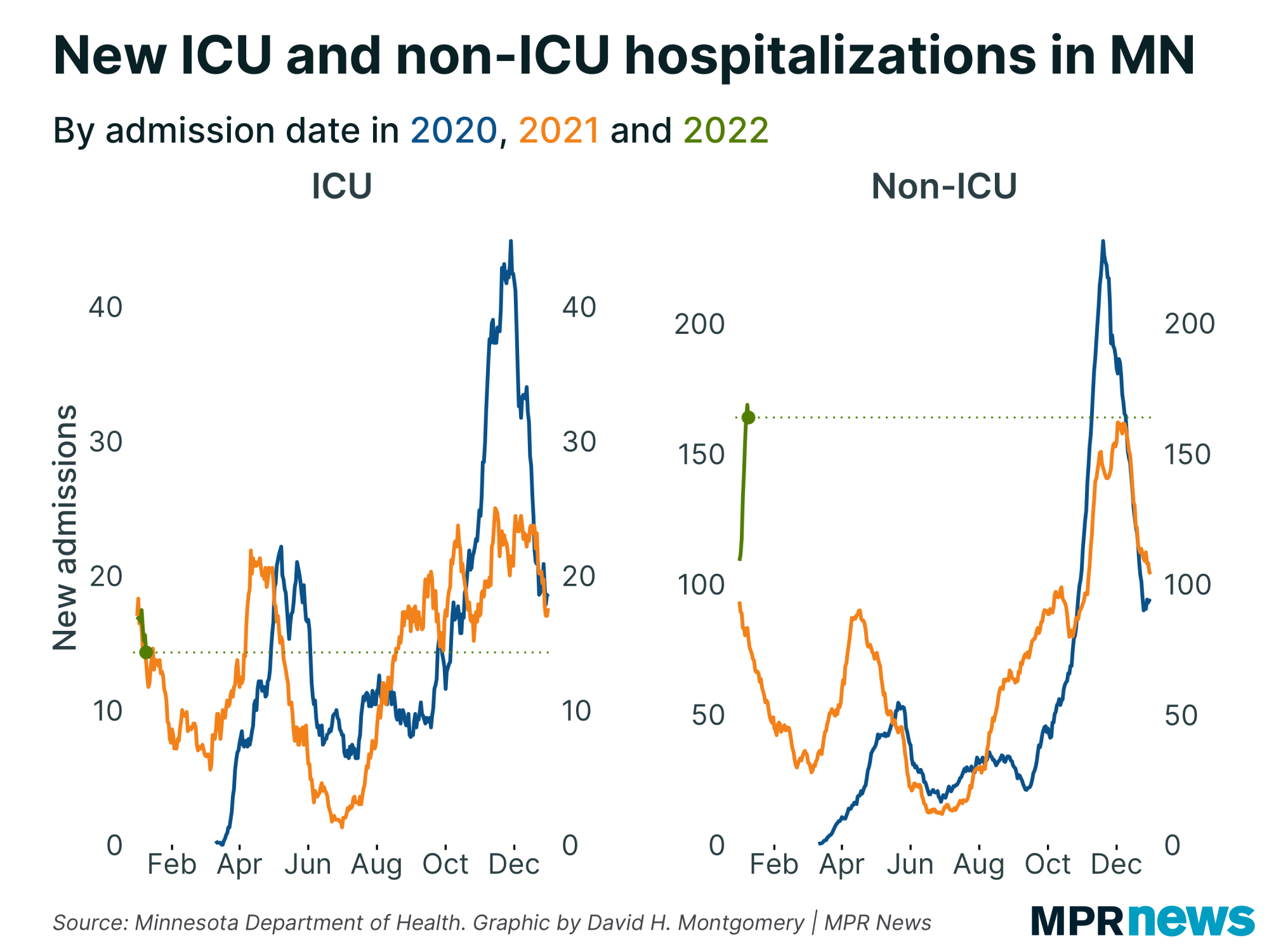
Right now we're seeing COVID-19 hospital admissions rise sharply — at least, for the less-serious non-ICU beds. |
| |
|
|
ICU admissions are still thankfully falling. Again, we can hope that this is durable, but at this point must seriously consider the possibility that it just takes a little longer after a wave hits for people to get sick enough to need ICU care.
We're also seeing non-ICU bed use rise sharply. Because Minnesota didn't fully recover from its delta wave before omicron hit, we don't actually have to add too many more patients before we get into record-setting territory. |
| |
|
|
| With this giant mess, there is one bit of silver lining for those of us hoping to understand what's happening with COVID-19 in Minnesota: I got access to the Met Council's data analyzing COVID prevalence in the Twin Cities' wastewater! | | |
|
|
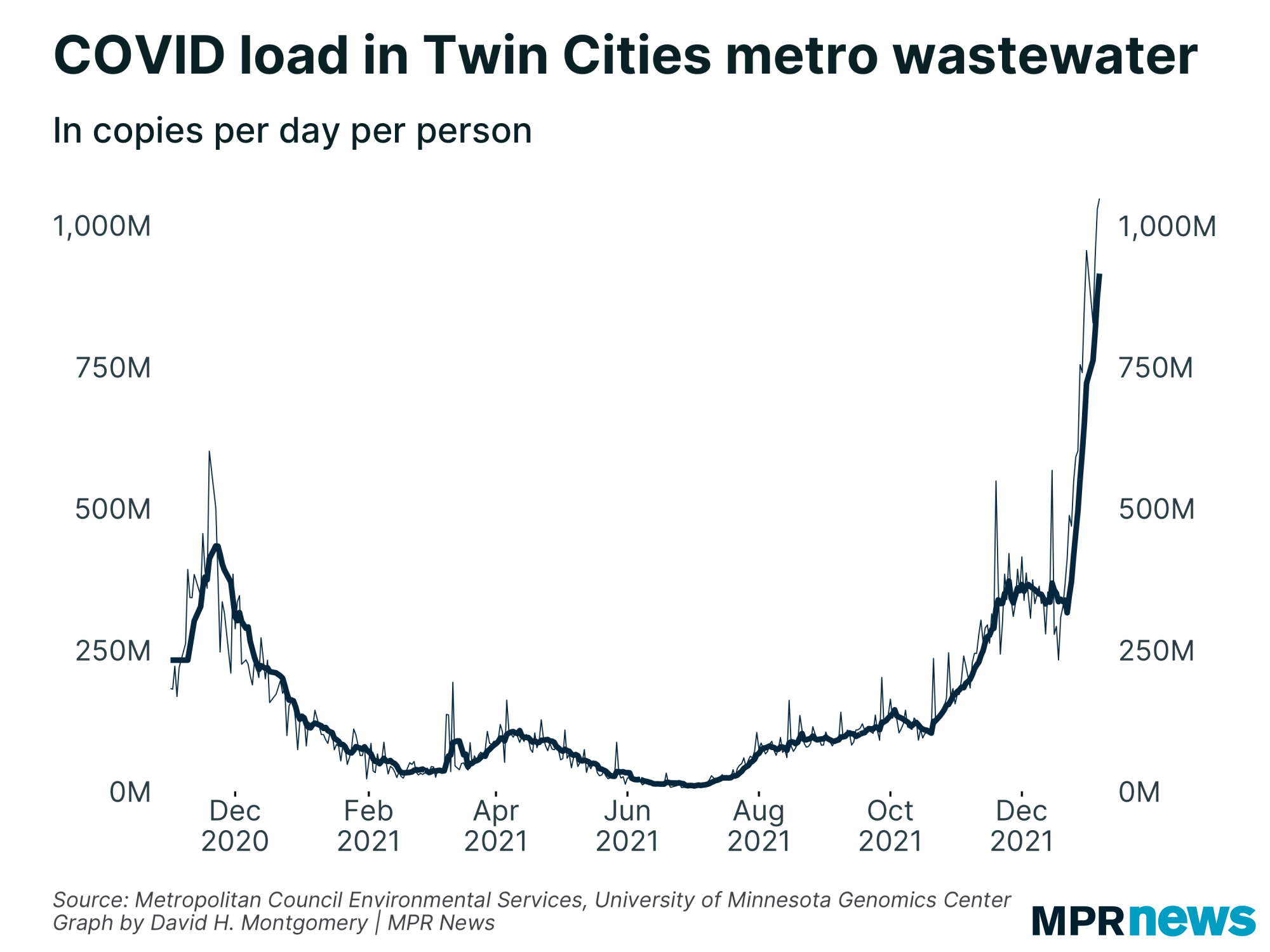
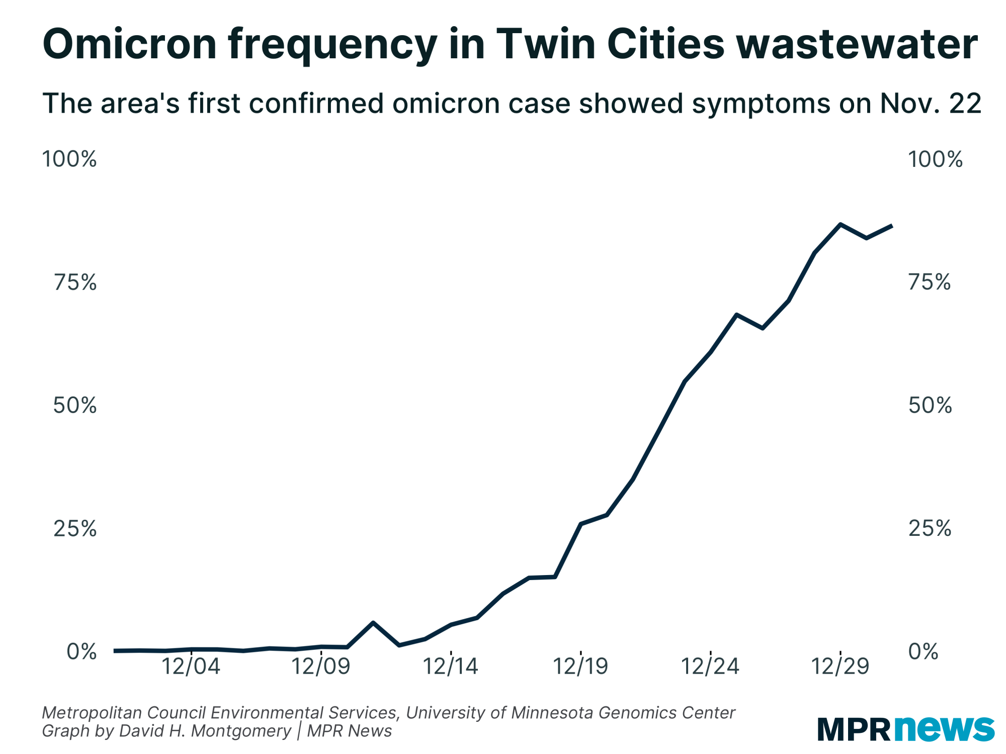
| COVID in our poop |
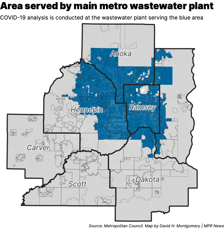
Research has shown since early in the pandemic that COVID-19 virus shows up in people’s feces. All that poop flows through the sewer system to wastewater plants. And at the main wastewater plant for the Twin Cities, Met Council scientists have been taking daily samples. When other scientists at the University of Minnesota's Genomics Center process the data, they can see how much viral material is in the metro area’s collective waste.
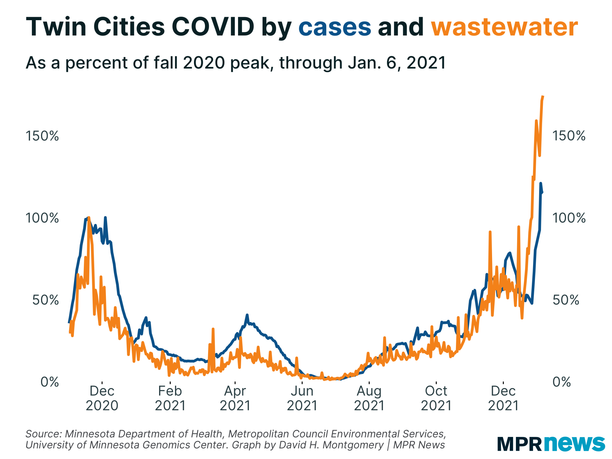
It can sound like a stretch. But it turns out that wastewater analysis closely matches other ways to track the virus like case counts — except wastewater can actually flag spikes faster than traditional testing.
Scientists have been monitoring COVID levels in Twin Cities wastewater for more than a year. Now, in response to a request from MPR News, the Met Council will be releasing the data to the public every week, starting in the coming days.
The wastewater analysis underscores just how dramatic Minnesota’s current omicron surge is. Right now, Twin Cities wastewater is reporting more than 1 billion viral copies per day per person. That’s double the previous highs, set in November 2020 and December 2021. |
| |
|
|
Levels of COVID-19 in Twin Cities wastewater started spiking right before Christmas 2021, around Dec. 22.
Reported case counts for the parts of the metro covered by that wastewater plant didn’t start going up until a week later, around Dec. 28. | |
|
|
|
As of Jan. 6, COVID levels in Twin Cities wastewater were 70 percent higher than the fall 2020 peak. Reported cases in the metro didn’t reach that level until six days later, on Jan. 12.
That only increases the ability of wastewater treatment to identify surges early — though the wastewater processing has its own lag time. Though the Met Council collects samples every day, they’re only delivered to the Genomics Lab for testing once per week.
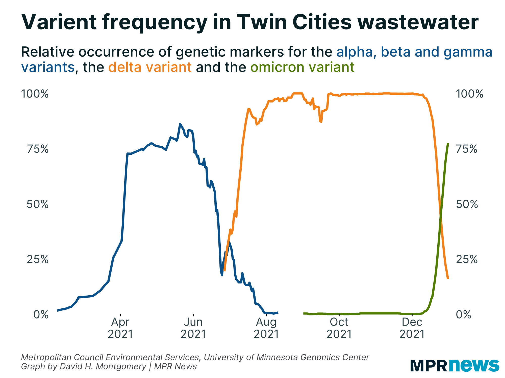
The genetic analysis performed at the Genomics Lab can also identify unique marker for variants such as delta or omicron.
The Twin Cities wastewater data noted a surge in markers representing the early COVID variants — alpha, beta and gamma — beginning in the late winter of 2021, and spiking around the start of April. That coincided with Minnesota’s spring COVID-19 wave.
A few months later, the wastewater data tracked the surge of the dangerous delta variant in summer 2021. And more recently, it followed the arrival of omicron in December. |
| |
|
|
The omicron variant arrived with particular speed. Minnesota’s first confirmed omicron case developed symptoms on Nov. 22 after returning from an anime convention in New York City. But omicron didn’t take off in the metro for several weeks, weeks where the delta variant continued to be dominant.
Starting around Dec. 13, however, omicron markers started to show up more and more in the metro’s poop. Omicron was accounting for more than 70 percent of the sample by Dec. 30, less than three weeks later. |
| |
|
|
| A brief note on the methodology here. This doesn't actually cover the entire seven-county metro area. Rather, this reflects samples from the main metro-area wastewater plant, which covers Minneapolis, St. Paul, and a lot of inner-ring suburbs. Further-flung suburbs generally use other wastewater plants that aren't being monitored like this one. | |
|
|
|
| And while the data is daily, unfortunately we'll only get updates once per week, as noted above. | | |
|
|
Below, I'll explore a few more stats about Minnesota's COVID-19 outbreak. If you want to learn more, I also recommend these other articles:
| | |
|
|
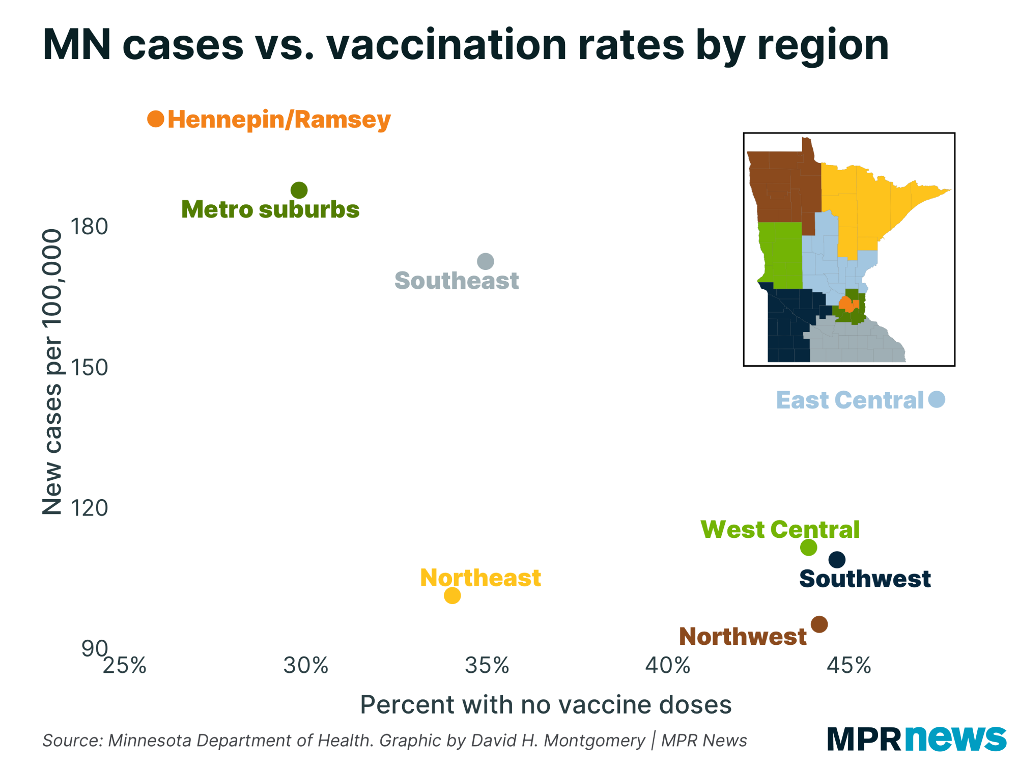
| COVID, populations and individuals | | There's a bit of a paradox right now in Minnesota's COVID-19 data. The places in the state with the most COVID right now are the ones with the highest vaccination rates. |
| |
|
|
How does that square with the studies showing the vaccinated are less likely to catch COVID?
Here's where it's important to distinguish between two different levels of analysis — the population and the individual.
Studies have shown that fully vaccinated individuals are much less likely to catch COVID, and especially less likely to develop severe cases. This has proven to be pretty robust in both experimental data and observational data. But that doesn't mean that at any given moment, a place with more vaccinated people will have fewer cases than another place with fewer vaccinated people.
That is a relationship that we would hope to see play out over the long term. And perhaps it's possible for a place to get to a level of population immunity where it just stops getting waves. But clearly we're not there yet. Even a heavily vaccinated place like Hennepin County still has more than 20 percent of its population unvaccinated — close to 300,000 people.
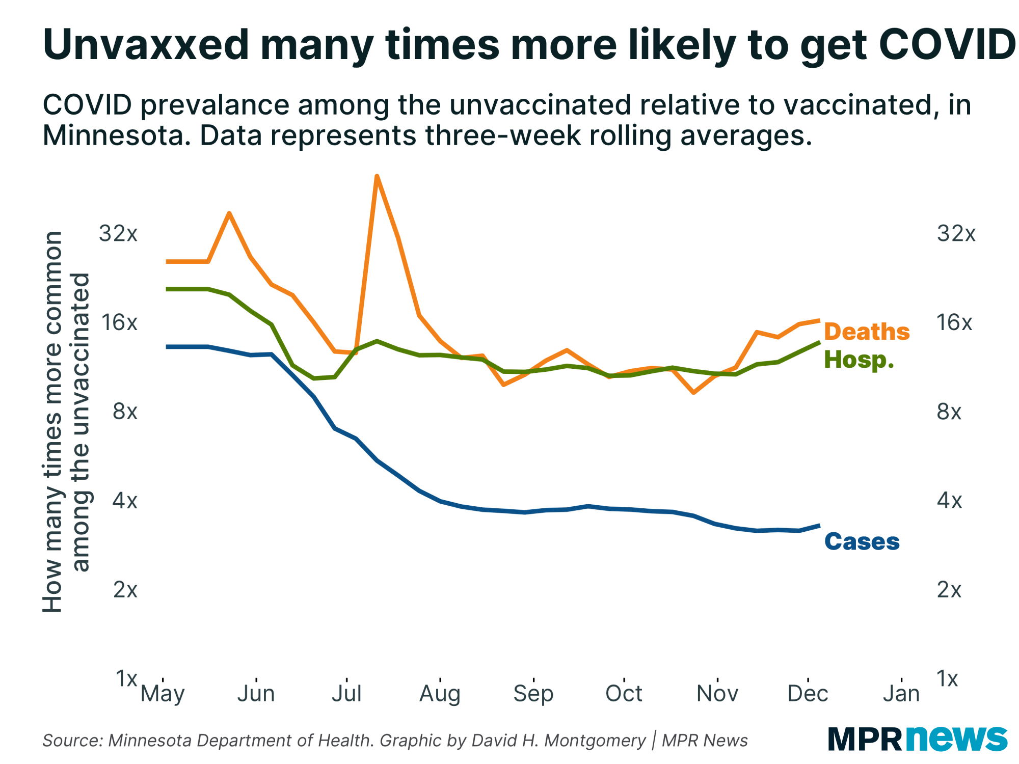
Let's refresh ourselves with what the data says about the relative vulnerability of vaccinated and unvaccinated people to COVID. Unfortunately Minnesota's data only goes through early December so far — pre-omicron — but data from places like New York City suggests omicron hasn't caused any drastic changes.
In Minnesota, the unvaccinated have been about 3.3 times more likely to have a COVID-19 case, 13.6 times more likely to be hospitalized with COVID, and 16.1 times more likely to die from it. |
| |
|
|
| I'm not an expert on complex mathematical probability (though I'll never get back the past hour I spent trying to be able look like one for you right now), but it's not absurd that at any given moment in time, a high-vax county would have more cases per capita than a low-vax county — even given the fact that each vaccinated individual is less likely to catch COVID. (Seriously, so much research into drawing-marbles-from-bags problems down the drain...) |
| |
|
|
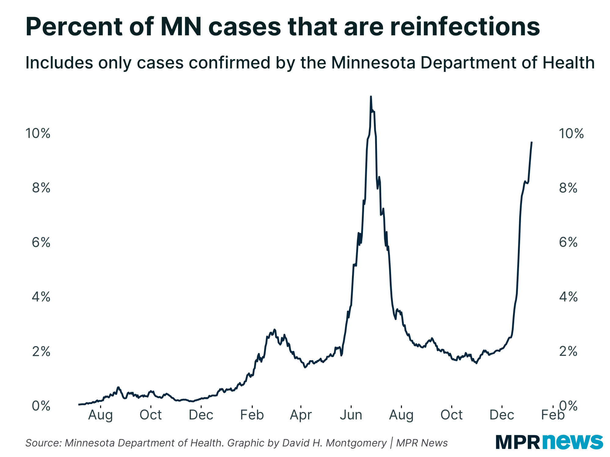
| Reinfection rates still rising | | Last time I noted a spike in the share of Minnesota's COVID-19 cases that are confirmed reinfections. That's still happening. | |
|
|
|
What's happening next?
|
When will we peak? There is reason to hope that this peak could come soon, within a week or two. To the degree that our bad data lets us do so, I'll be trying to pinpoint any signals that such a peak might be approaching.
Thanks for subscribing to this newsletter and for all of you who've sent me your feedback. As always, if you like this newsletter, please share it and the sign-up link with others who you think might enjoy it.
— David |
| |
|
|
%%[ if _MessageContext != "VAWP" then ]%%
Preference Center ❘ Unsubscribe You received this email because you subscribed or it was sent to you by a friend. This email was sent by: %%Member_Busname%%
%%Member_Addr%% %%Member_City%%, %%Member_State%%, %%Member_PostalCode%%
  |
%%[ endif ]%% |
|
| | |